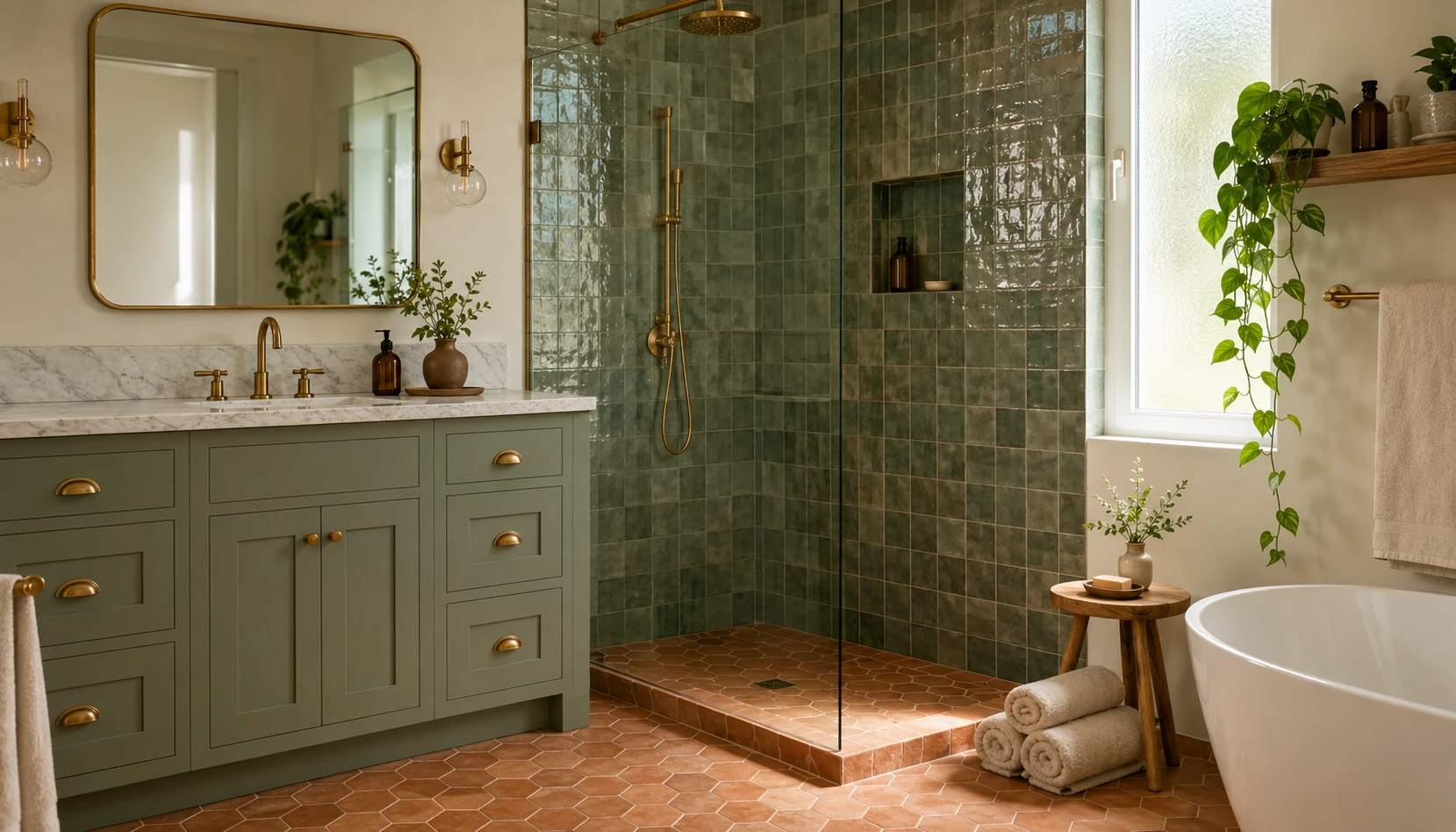
A few years ago, the bathroom was the last room anyone thought to paint an actual color. White tile, white walls, chrome everywhere, done. That’s changed, and sage green is a big part of why. It’s the one green that reads as almost-neutral, so it does the job a beige or a light grey used to do, except it actually has some warmth and personality to it.
Part of the appeal is practical. A lot of bathrooms are small, badly lit, and windowless, and sage handles all three of those problems better than most colors. It doesn’t demand direct sunlight to look good the way a true jewel-tone green does. It photographs well under a warm bulb. And because the color sits so close to neutral, it doesn’t fight with whatever tile or fixtures were already in the room.
The other reason it’s everywhere right now is that it pairs with almost anything you’d want in a bathroom anyway: brass, terracotta, oak, white marble, even black hardware if you want more contrast. That flexibility is rare. Most colors force you to commit to one direction. Sage lets you go spa, farmhouse, coastal, or modern-minimalist depending on what you put next to it.
Here are 12 ways to actually bring it into a bathroom, whether you’re planning a full renovation or just want to test the color out before committing to tile.
Why Sage Ended Up in the Bathroom
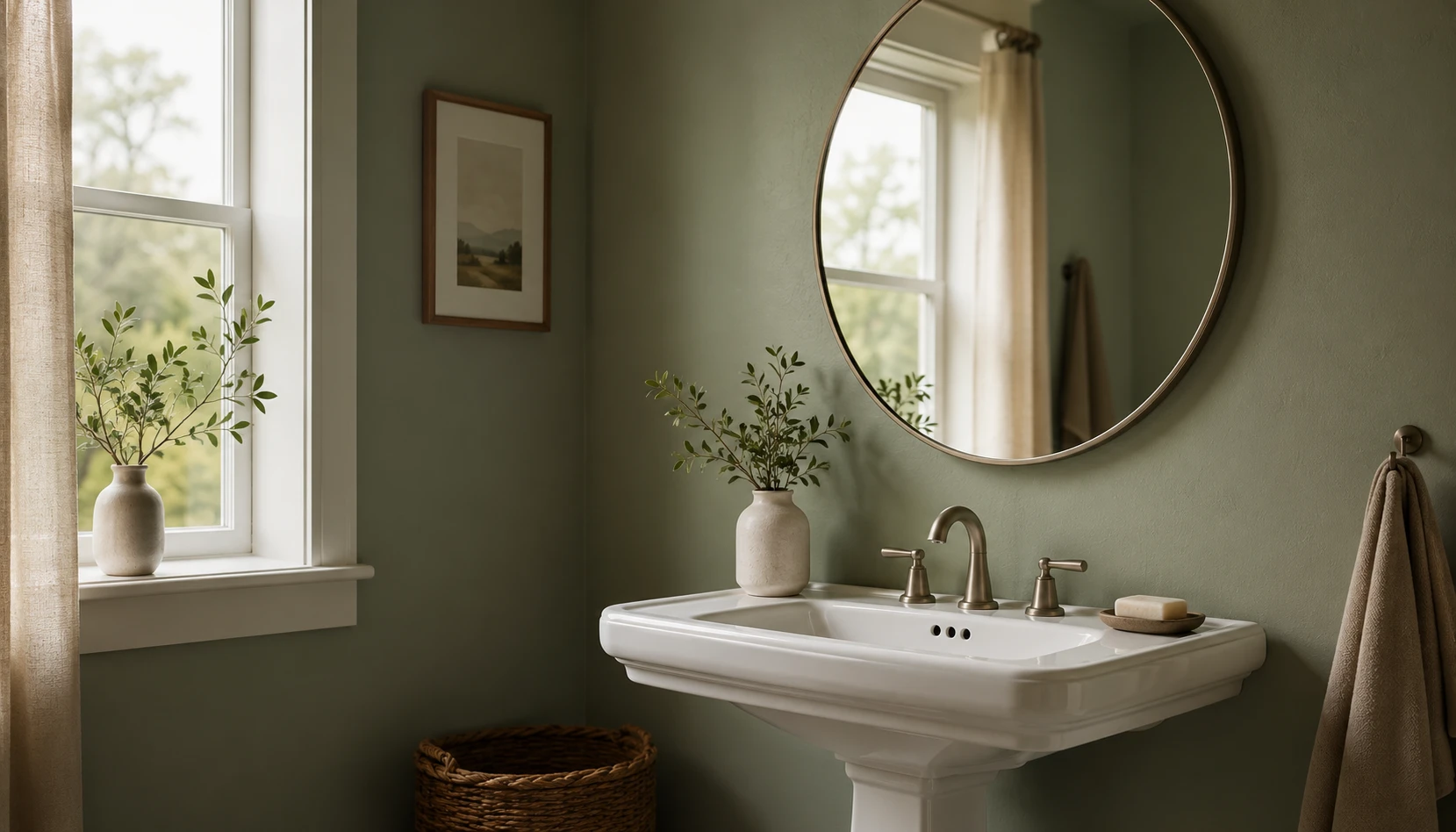
It behaves like a neutral, which most greens don’t. True green, the kind you’d find on a golf course, is a hard sell in a bathroom. Sage has enough grey in it that it reads as calm rather than loud, which is exactly what you want in a room people use half-asleep at 6am.
It doesn’t need great light to look good. A lot of bathrooms only get light from a small window or none at all. Bright greens like emerald or kelly need natural light to avoid looking flat or slightly grim under a bathroom bulb. Sage holds its color under ordinary vanity lighting, which is the actual lighting condition most bathrooms live in.
It’s the safest green for resale. If you’re renovating a home you might sell in five years, sage is the green least likely to look dated or polarizing later. It occupies roughly the same spot beige did for the last decade: broadly likeable, easy to work around, hard to actively dislike.
It pairs with materials that are already common in bathrooms. White subway tile, marble, oak vanities, brass or chrome fixtures, sage sits next to all of it without a fight. That’s not true of every trend color. A saturated teal or a cool blue-grey can clash with warmer materials in ways sage simply doesn’t.
It’s genuinely calming, and that matters in this specific room. Bathrooms are one of the only rooms in a home where the whole point is to slow down for a few minutes. Sage’s muted quality supports that in a way a high-energy color wouldn’t.
If you already have sage green somewhere else in your home, in the bedroom or living room, extending it into the bathroom creates a thread of color that runs through the whole house without feeling matchy. See our Sage Green Bedroom Ideas guide if you’re building that connection room to room.
Picking the Right Shade of Sage
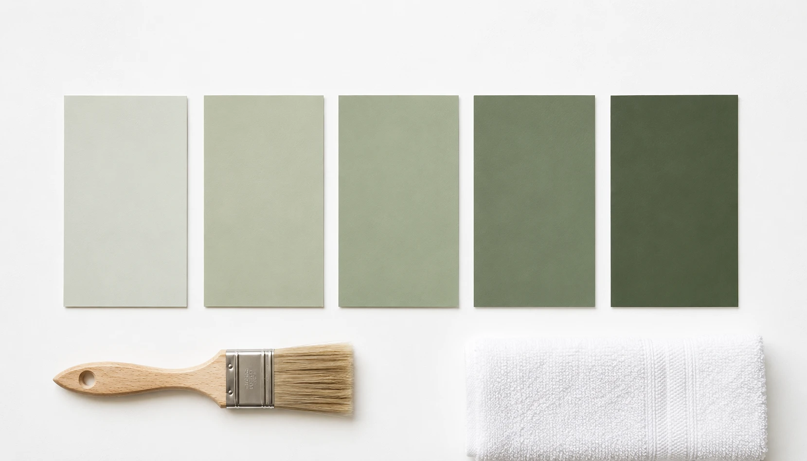
Sage isn’t one color, it’s a range, and the undertone changes everything. Some sages lean yellow-green, almost olive. Others lean grey-green, closer to what people mean when they say “eucalyptus.” In a bathroom specifically, the grey-leaning versions tend to hold up better, since they don’t fight with cool bathroom lighting the way a warmer, yellow-leaning sage sometimes does.
A few specific paints keep coming up for a reason. Benjamin Moore’s Sage and Sherwin-Williams’ Privilege Green are both grey-green enough to read as sophisticated rather than crafty. Farrow & Ball’s Mizzle leans slightly cooler still and works well in bathrooms that already have grey-veined marble or grey tile.
Sheen matters more here than in any other room. Flat paint has no place in a bathroom. Steam and splashes need a satin or eggshell finish that can be wiped down without leaving marks, and the slight sheen also helps the sage read a bit richer than it would in flat.
Test it under your actual bathroom bulb, not daylight. A sage that looks perfect on a paint chip near a window can shift noticeably under a 3000K vanity bulb versus a cooler 4000K one. Tape a large sample directly onto the wall and look at it at night with the bathroom lights on, since that’s when most people are actually using the room and judging how it looks.
Trim color decides how the sage reads. A creamy off-white trim softens sage and keeps it from feeling clinical. A stark white trim sharpens it and pushes it toward a more modern, slightly cooler look. Neither is wrong, but they produce genuinely different rooms from the same wall color.
Sage Green Zellige Tile Showers
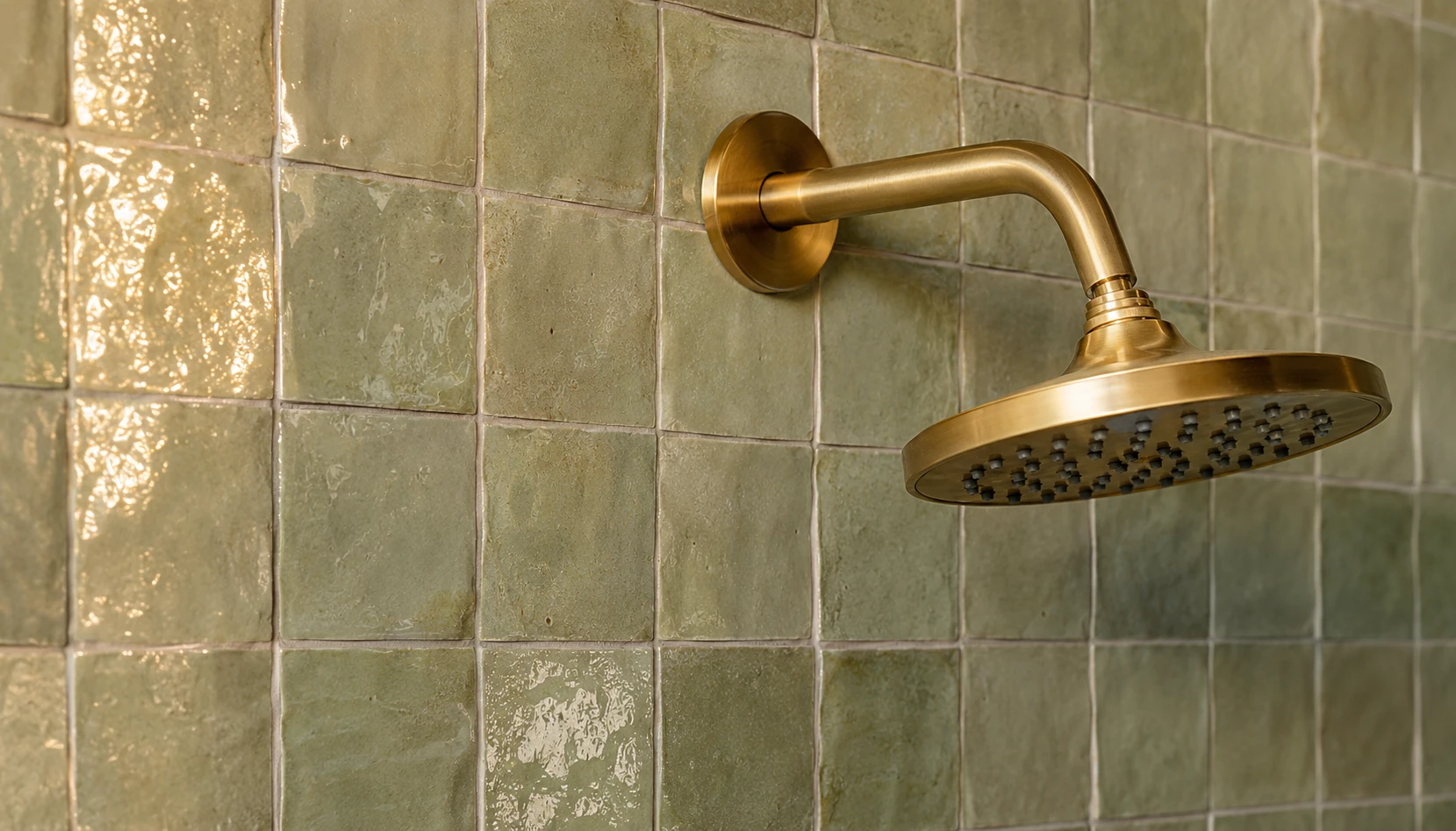
Zellige is the tile everyone wants right now, and sage is one of its best colors. These are handmade Moroccan tiles with slight variations in glaze and shape from tile to tile, which means the color shifts subtly across the wall instead of sitting flat the way a machine-made tile does. On a plain color like sage, that texture is what separates a shower that looks considered from one that looks like a paint sample stretched across the wall.
A full sage zellige shower with brass fixtures is the version most people are chasing. Line the shower walls in sage zellige, keep the rest of the room in white or cream large-format tile, and add a brushed brass showerhead and towel bar. The zellige catches the shower’s light differently depending on the time of day, and the brass warms the whole thing up instead of leaving it feeling cold and tiled.
Cost is genuinely a range, so know what you’re signing up for. Real zellige for a shower area typically runs somewhere in the twenty to forty dollar per square foot range for material alone, before installation, which is a meaningful step up from standard subway tile. Zellige-look porcelain alternatives exist for less, and they photograph almost identically, though they lose some of the handmade shadow variation up close.
A feature wall is the lower-commitment version. If a full shower feels like too much, tile just the vanity wall or the wall behind the tub in sage zellige and keep the shower itself in plain white subway. You get the texture and the color statement without tiling the whole wet area.
Grout choice can quietly ruin or make the look. A grey-green undertone in the tile matches best with a soft grey grout. White grout on a warmer, more olive-leaning sage can look chalky rather than clean. It’s a small decision that’s easy to get wrong if you’re not paying attention at the sample stage.
Sage and Terracotta Together
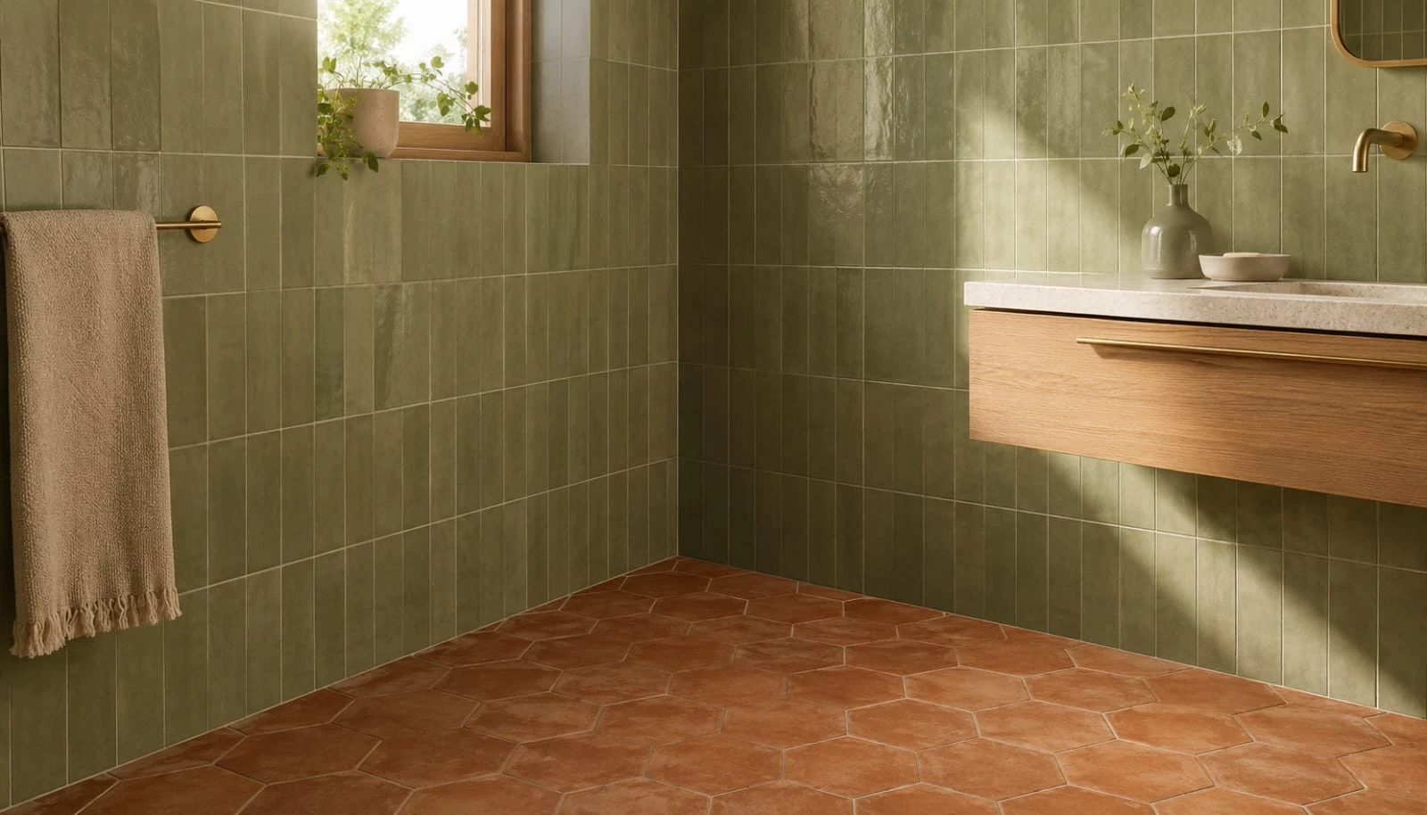
This combination shows up constantly for a simple reason: neither color is trying to be the loud one. Sage is a quiet green, terracotta is a quiet orange-red, and putting two quiet, earthy colors next to each other reads as considered rather than busy. It’s a Mediterranean pairing at heart, and it carries that warmth even in a bathroom with zero natural light.
Sage tile on the walls with terracotta on the floor is the most common split. Sage subway tile in the shower, terracotta hexagon or herringbone tile underfoot, keeps the two colors from directly competing while still letting both be seen. The floor grounds the room, the walls cool it down slightly, and brass ties the two together.
A terracotta tub surround with a sage-painted wall is a quieter, smaller-scale version. You don’t need floor-to-ceiling tile to get the pairing. A terracotta tile surround around a freestanding tub, sage paint on the wall behind it, and a linen shower curtain on a brass rod gets most of the same effect with far less material and labor.
If tile feels permanent and scary, start with accessories. Terracotta bath mats, rust-toned towels, a terracotta soap dish, these bring the pairing in without touching the tile or paint at all. It’s the version to try first if you’re not sure you’ll love the combination in six months.
A checkerboard floor in both colors is the boldest version of this idea. Alternating sage and terracotta tiles in a checkerboard pattern on the floor, paired with a plain white vanity and minimal brass fixtures, turns the floor into the actual design statement of the room rather than a background. It’s not subtle, and it’s not meant to be.
If terracotta is already a color you’ve used elsewhere in the house, our White and Terracotta Bedroom Ideas guide covers the same pairing for a bedroom.
The Sage Green Vanity
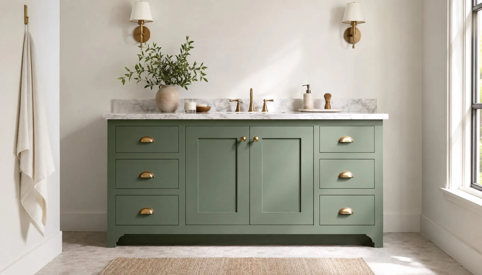
A painted vanity is genuinely the easiest way into this whole trend. If tile and paint both feel like too much commitment, a sage green vanity against white walls delivers most of the visual impact for a fraction of the cost and effort. It’s furniture, not fixed to the house, which also makes it the lowest-risk option if you rent or just aren’t sure yet.
Shaker-style doors with aged brass hardware is the look most people land on. Simple flat-panel shaker fronts in sage, paired with brass cup pulls or knobs, reads as timeless rather than trendy. This is the version that’s least likely to look dated in five years, which matters if you’re not planning to redo the bathroom again anytime soon.
Pairing it with a marble top changes the whole feel. A white or warm-veined marble counter on a sage vanity pushes the look toward quiet luxury rather than cottage-casual. If your budget stretches to real marble, this is where to spend it. If it doesn’t, a marble-look quartz gets you most of the way there without the maintenance concerns real stone brings into a wet room.
Existing vanity? You can paint it rather than replace it. A cabinet-grade paint or a bonding primer plus a durable enamel can take a plain white or oak vanity to sage green in a weekend, at a fraction of the cost of replacing the whole piece. This is worth doing before assuming you need new furniture.
Modern minimalist versions skip the marble for sleek flat panels. If shaker style feels too traditional for your space, a flat-front sage vanity with integrated brass or matte black pulls and a large-format neutral floor tile gets the same color without the farmhouse lean.
Brass, Black, or Chrome
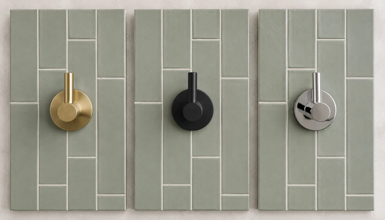
Brass is the pairing most people reach for, and it’s the safest bet. Warm brass against sage green creates the effect most 2026 bathroom photos are chasing: something that feels like a nice hotel rather than a hardware store showroom. Brushed brass reads a little more contemporary and a little less shiny than polished brass, which is why most of the current sage bathrooms lean brushed rather than mirror-polished.
Matte black is the move if you want more contrast and a bit of edge. Black fixtures against sage tile create a sharper, more graphic look than brass does. It works especially well with deeper, more saturated sage rather than the palest grey-green versions, since the darker green has enough visual weight to stand up to black hardware without looking washed out.
Chrome and nickel are the quiet, traditional choice. If brass feels too warm or too trendy for your taste, chrome or polished nickel keeps the whole room feeling cleaner and more classic. This pairing works best with lighter, cooler sage tones, since the metal’s coolness matches the tile’s undertone rather than fighting it.
Mixing metals in the same bathroom is riskier than people think. One metal finish throughout, faucet, towel bar, mirror frame, light fixtures, reads as intentional. Two competing warm and cool metals in the same small room usually just reads as unplanned rather than eclectic. If you want to mix, keep one metal dominant and use the second only in a single small accent.
Whichever metal you choose, keep it consistent with anything else metal in the room. A brass faucet next to a chrome towel bar is the kind of small mismatch that’s easy to miss when you’re buying pieces separately over a few months, and hard to unsee once you notice it.
Sage Green in a Windowless Bathroom
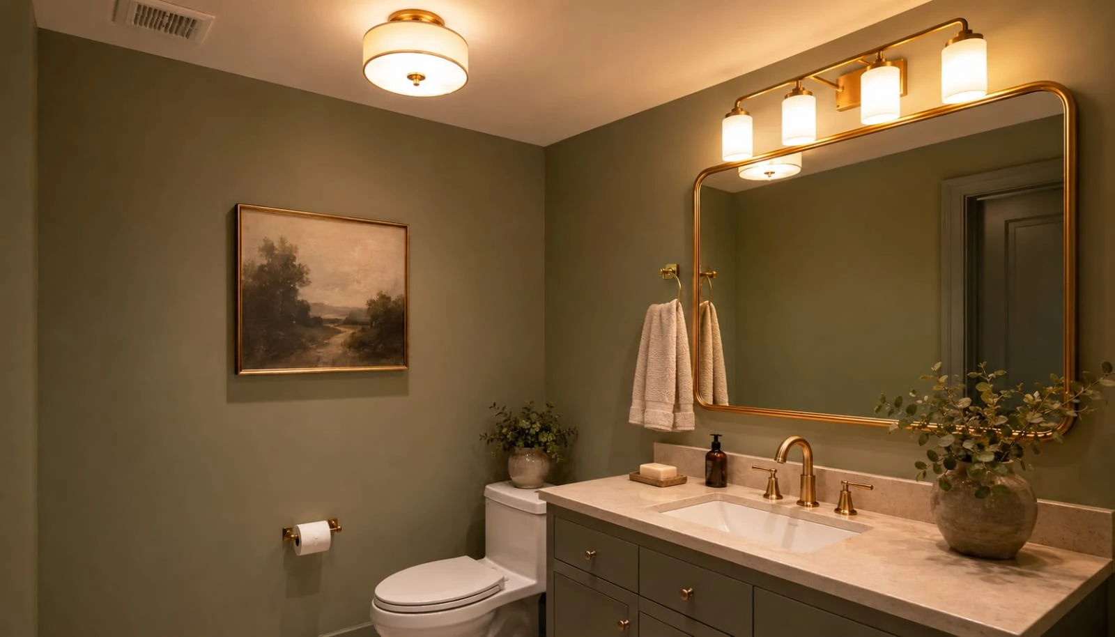
Yes, sage works with no natural light at all, but you have to choose the right depth. In a windowless bath, a lighter sage keeps the room feeling bright while still bringing in color. A very deep forest green in the same windowless room can start to feel heavy rather than cozy, since there’s no daylight coming in to lift it.
The bulb temperature matters as much as the paint color. A warm 2700K bulb pulls sage toward its earthy, cozy side. A cooler bulb pushes the same paint color toward something flatter and slightly grey. This is genuinely one of the most overlooked variables in how a bathroom color actually reads day to day.
A deep, almost-black-green can still work in a windowless powder room specifically, just not a daily-use bathroom. Powder rooms get used for minutes at a time, not twenty-minute showers, so a moodier, darker green with warm brass and a large mirror can feel dramatic and intentional rather than cave-like. Try that same depth in a windowless family bathroom used every morning and it tends to feel oppressive instead.
A large mirror is doing more work than people realize in these rooms. Without a window to reflect, a mirror is the only thing bouncing light back into a windowless bathroom. Go bigger than feels necessary, ideally covering most of the wall above the vanity, and the room will read noticeably brighter for it.
Layer at least two light sources, not just the vanity bar. A single row of bulbs above the mirror leaves the rest of a windowless room dim. Adding a ceiling fixture or a small sconce elsewhere in the room fills in the shadows sage can otherwise fall into without daylight.
Small Bathroom Sage Green Ideas
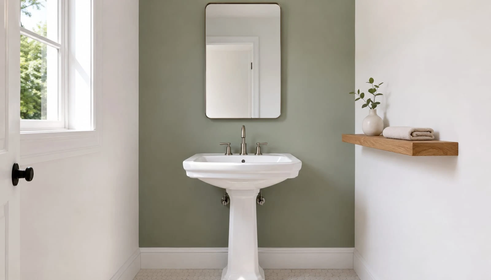
A small bathroom can take more sage than you’d expect, precisely because sage is so close to neutral. A saturated, dark color can make a tiny room feel like a closet. Sage, especially in its lighter variations, doesn’t carry that same risk, which is part of why it’s become the go-to color for small powder rooms and guest baths specifically.
Keep fixtures light if the room is genuinely tiny. White fixtures against sage walls or sage tile keep a small bathroom feeling open. Adding a sage vanity on top of sage walls in a very small room can start to feel like being inside a green box, so if you love the color everywhere, use it in the tile or paint and keep the vanity a contrasting white.
A single sage accent wall behind the vanity is the lowest-risk starting point. Rather than committing the whole small room to sage, paint or tile just the wall behind the mirror. It gives you the color statement as the first thing you see walking in, without wrapping the whole tiny space in one tone.
Open shelving reads lighter than a closed cabinet in a small sage bathroom. A floating oak shelf instead of a full vanity cabinet keeps sightlines open across the room, which matters more in small spaces than almost anywhere else. This pairs with the same open-shelving logic we cover in our Small Kitchen Ideas guide.
A vertical stripe of tile draws the eye up, not across. In a small bathroom, running sage tile in a tall vertical band rather than a horizontal one makes the ceiling feel higher, which matters more than floor space in a room this size.
Textiles and Small Accents
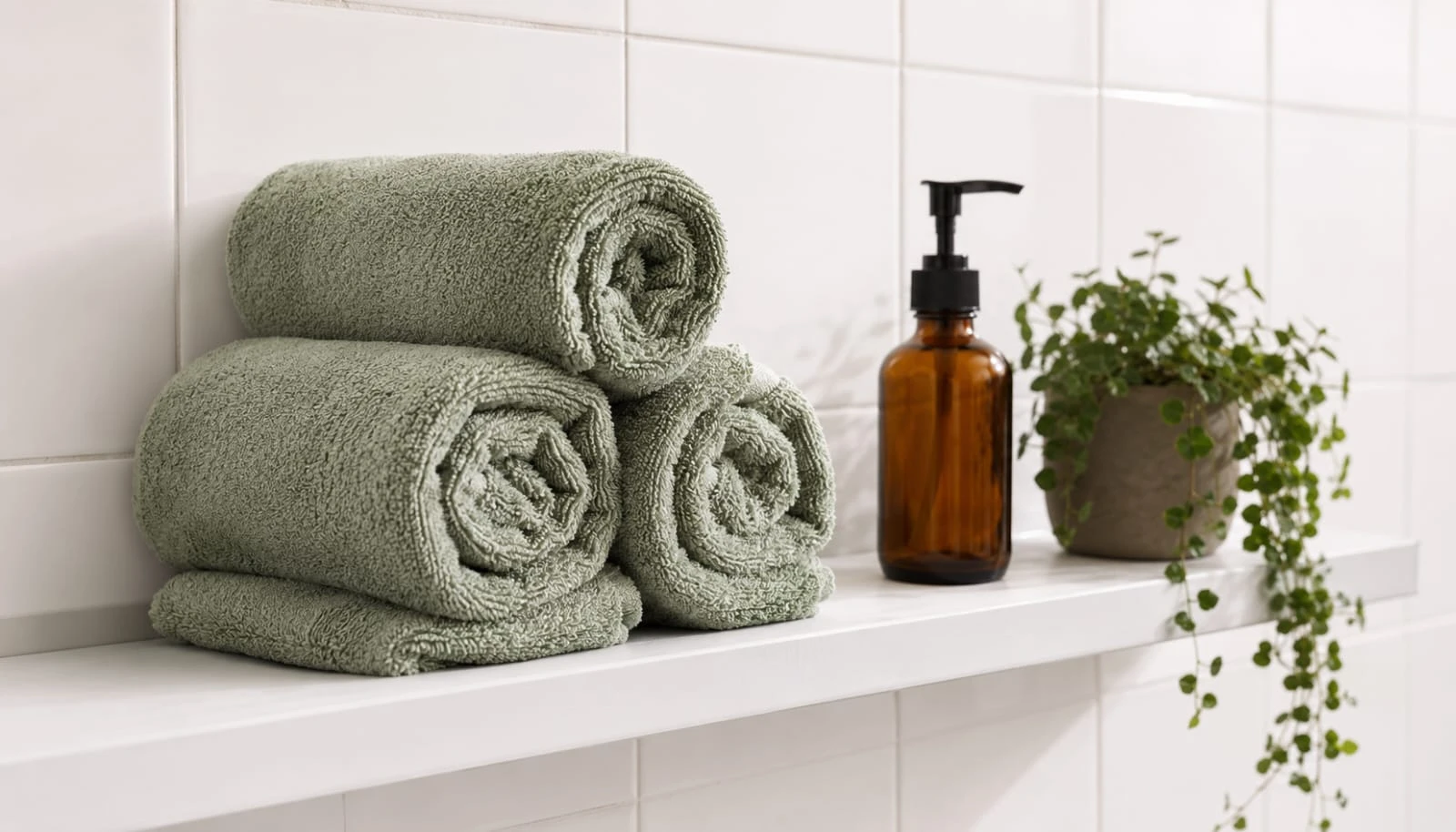
Towels are genuinely the easiest place to start, and most people underuse this. A set of sage green towels against white tile and fixtures brings the color in instantly, with zero permanence and almost no cost compared to any tile or paint option. If you’re renting or just testing whether you actually like sage before committing further, start here.
A bath mat and shower curtain do more visual work than their size suggests. These are two of the largest fabric surfaces in most bathrooms, so changing them to sage has an outsized effect relative to how little they cost. A linen-look shower curtain in sage or cream reads more expensive than a shiny vinyl one, worth the small difference in price.
Small ceramic pieces carry the color into places tile can’t. A sage soap dispenser, a toothbrush holder, a small tray for the vanity, these let the color show up in three or four small spots around the room rather than one big block, which can actually feel more intentional than a single large gesture.
Amber glass accessories pair surprisingly well with sage. Amber glass jars or soap dispensers pick up the warmth from brass fixtures while echoing the earthy quality of the green. It’s a small detail, but it’s the kind of thing that makes a bathroom photograph like it was actually styled rather than just decorated.
A plant is doing more than decoration here. Real greenery beside a sage tub or vanity reinforces the color’s whole point, connecting the room to something natural rather than purely painted on. A low-maintenance plant like a pothos or a small fern tolerates bathroom humidity better than most houseplants, which makes this an easy win rather than something to worry about keeping alive.
Wood, Marble, and Natural Materials
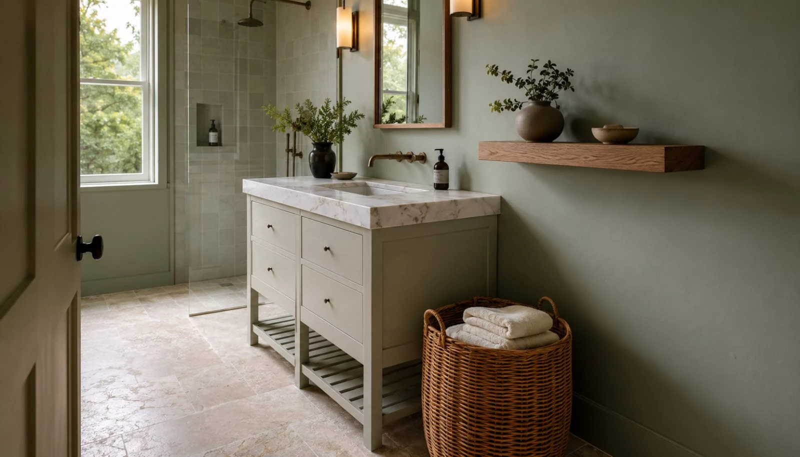
Oak does more for sage than almost any other single addition. A floating oak vanity, an oak shelf, or even just a wood-framed mirror softens sage in a way paint alone can’t. The warmth in the wood grain balances the coolness in the green, and the combination is what most people mean when they picture a spa-style bathroom rather than a plainly painted one.
White or warm-veined marble keeps sage from feeling heavy. Marble brings brightness into the room, which matters especially in a color that already leans muted. Warm-veined marble, rather than stark bright-white marble, tends to suit sage better, since the two undertones support each other instead of one reading cool and one reading warm.
Rattan and woven textures add the same warmth on a budget. If real wood furniture or marble counters aren’t in the plan right now, a woven rattan mirror frame, a rattan pendant light, or a woven storage basket brings in a similar organic warmth for a fraction of the cost.
Stone flooring underfoot grounds the whole room. Natural stone tile, even a budget-friendly travertine-look porcelain, adds texture underfoot that plain sage walls alone don’t provide. The combination of textured stone below and smooth painted sage above creates the layered feel that separates a considered bathroom from a flat one.
Avoid pairing sage with anything too glossy or cold. High-gloss white subway tile next to sage can push the room toward clinical rather than calm. A honed or matte finish on surrounding tile keeps the whole room feeling like it belongs together.
A Renter-Friendly Version
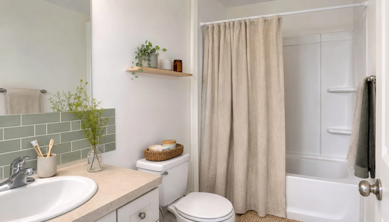
Peel-and-stick tile has gotten genuinely good, not just passable. Sage green peel-and-stick tiles, some designed to mimic zellige’s handmade texture, can cover a backsplash or even a shower surround (check the specific product’s water rating first) without a single hole drilled or a landlord conversation needed. Removal is clean if you buy a quality product rather than the cheapest option available.
A tension rod shower curtain setup needs no drilling at all. A sage or sage-adjacent linen shower curtain on a tension rod, rather than a wall-mounted one, brings in the color and the fabric texture with zero permanent installation.
Contact paper works on an existing vanity you’re not allowed to paint. A sage green contact paper or removable vinyl wrap can update laminate cabinet fronts temporarily, and it comes off cleanly at move-out if you choose a genuinely removable product rather than a generic adhesive vinyl.
Command strips handle everything else. A wood-framed mirror, a small shelf, a hanging plant, all of it can go up and come down without a single hole in a rental bathroom, using the same command-strip approach we cover in our Small Living Room Ideas for Renters guide.
Bring your landlord-approved elements when you move. Towels, the shower curtain, the bath mat, small ceramics, none of this stays behind. Building your sage bathroom around movable pieces means the investment follows you to the next place instead of staying with a rental you’ll eventually leave.
Mistakes Worth Avoiding
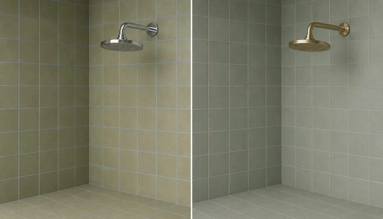
Mixing a yellow-leaning sage with cool blue-grey tile is the single most common clash. The undertones fight each other, and the combined effect can read as dirty or muddy rather than intentional. Pick tile and paint from the same undertone family before buying either one.
Flat paint in a bathroom is a mistake regardless of color. Steam and splashes need a wipeable satin or eggshell finish. This isn’t specific to sage, but it’s worth repeating since flat paint is still the accidental default a lot of people grab.
Going too dark in a room with little to no natural light. A deep forest or blackened sage in a windowless daily-use bathroom, without serious warm layered lighting and a large mirror to compensate, tends to feel heavier than intended. Save the darkest shades for powder rooms used briefly rather than bathrooms lived in every morning.
Skipping the actual paint test under your bathroom’s real lighting. A color that looks perfect on the chip under a showroom’s daylight bulbs can shift noticeably under your own bathroom’s specific fixture. Always sample directly on the wall and check it at night with the lights actually on.
Cold metal finishes on a warm-leaning sage. Chrome next to an olive-leaning sage can look slightly off in a way that’s hard to name but easy to notice. Match warm sage with warm metal, and save chrome for the cooler, greyer sage shades.
Sage green earned its place in the bathroom the honest way: it solves real problems most bathrooms actually have, bad light, small footprint, a need to feel calm rather than clinical, better than most alternatives do. Whether you’re tiling a full zellige shower or just swapping in a set of towels for a weekend, the color rewards a little attention to undertone and lighting far more than it punishes any particular style choice.
Start with the lowest-commitment version that fits your situation, towels if you’re renting, a painted vanity if you own but aren’t ready for tile, a full zellige shower if you’re already mid-renovation. Sage is forgiving enough that almost any entry point works.
For more on where sage fits elsewhere in a home, see our Sage Green Bedroom Ideas and Olive Green Living Room Ideas guides, both of which pair naturally with a sage bathroom down the hall.