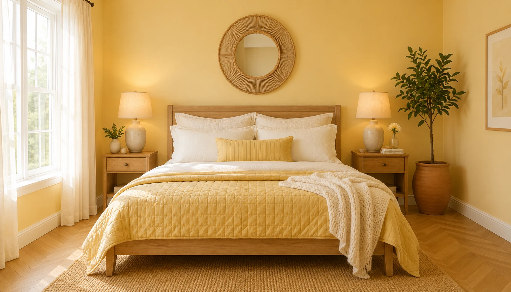
Butter yellow has become the color of the moment. It moved from fashion runways and accessories into interiors, and the bedroom is where it’s landed hardest. Unlike the sharp lemon yellows of past trends, this version is soft and buttery, closer to warm cream than bright sunshine.
What makes it work in bedrooms is the balance: it energizes a space while still feeling soothing enough for rest. It also does something useful with light, especially in rooms that don’t get strong all-day sun, taking the edge off cool shadows and giving the room a warm glow. In a north-facing bedroom, that difference is noticeable the moment you wake up.
Butter yellow also works because it behaves more like a warm neutral than a bold statement color. It pairs with cream, sage green, terracotta, natural wood, and brass, so it fits into the earthy color families already popular in bedroom design. You can commit to it fully or introduce it gradually, and it reads as intentional either way.
Here are 12 ways to bring butter yellow into a bedroom, from full paint commitment down to a single styled accent.
Why Butter Yellow Works So Well in Bedrooms
Before getting into specific ideas, it’s worth understanding what makes butter yellow different from other yellows.
It behaves like a warm neutral. Unlike bright lemon or mustard yellow, butter yellow is muted and soft. That means you can use it generously, even across full walls, without it overwhelming the space the way a bolder yellow would.
It reflects light beautifully. In bright rooms it glows warm and inviting. In rooms with less natural light, especially north-facing bedrooms, it softens cool shadows and gives off a warm ambient glow through the day.
It feels optimistic without being sugary. Butter yellow reads as more grown-up and sophisticated than pastel yellow. It has enough depth and warmth to feel intentional and designed, rather than childlike.
It pairs with almost everything. Cream, sage green, terracotta, navy, brown, and brass all sit well alongside butter yellow. That’s probably its biggest strength: you can build a full room around it without much risk.
It works at any scale. You can paint an entire room in butter yellow for a fully immersive effect, or introduce it through bedding, a single accent wall, or a few styled objects. It adapts to how much commitment you’re ready for.
It suits where interior design is heading right now. 2026 has leaned toward personality and warmth over cookie-cutter neutrals, and butter yellow fits that shift. It has real personality without losing the calm, livable quality a bedroom needs.
That mix of warmth and flexibility explains why butter yellow has become one of the most searched-for bedroom colors this year.
Choosing the Right Butter Yellow Shade
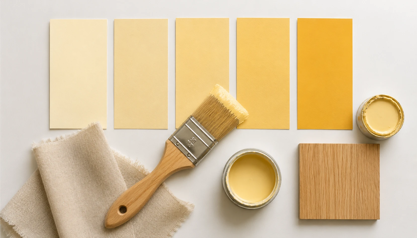
Butter yellow can range from nearly cream to a deeper golden tone. Choosing the right shade for your bedroom depends on your light, your room size, and the mood you want to create.
Pale butter yellow. The softest version, almost a warm cream with the faintest yellow undertone. This is the safest choice for small or dark bedrooms because it stays close to a neutral while still adding warmth.
Classic butter yellow. A true buttery shade with visible warmth and a soft golden quality. This is the most popular choice for full-wall applications, striking the balance between statement and neutral.
Deeper golden butter. A richer, more saturated version that leans slightly toward mustard without losing its softness. Best used as an accent wall or in smaller doses, since full rooms in this depth can feel heavier.
Avoid true lemon or acid yellow. These brighter, cooler yellows read as sharp and energizing rather than warm and calming, which works against the restful quality a bedroom needs.
Always sample first. Paint a large swatch directly on your wall and observe it morning, midday, and evening. Butter yellow shifts noticeably with light, appearing softer and creamier in low light and more golden in bright sun. What looks perfect at noon might feel different by evening lamp light.
Consider your room’s light direction. North-facing rooms with cooler light can handle a slightly warmer, more golden butter yellow. South-facing rooms with abundant warm light often look best with a paler, softer shade to avoid feeling overly saturated.
Getting the shade right is arguably the most important decision in a butter yellow bedroom. The tone should read as warm and buttery, never sharp or artificial.
Butter Yellow Walls: Full Immersion
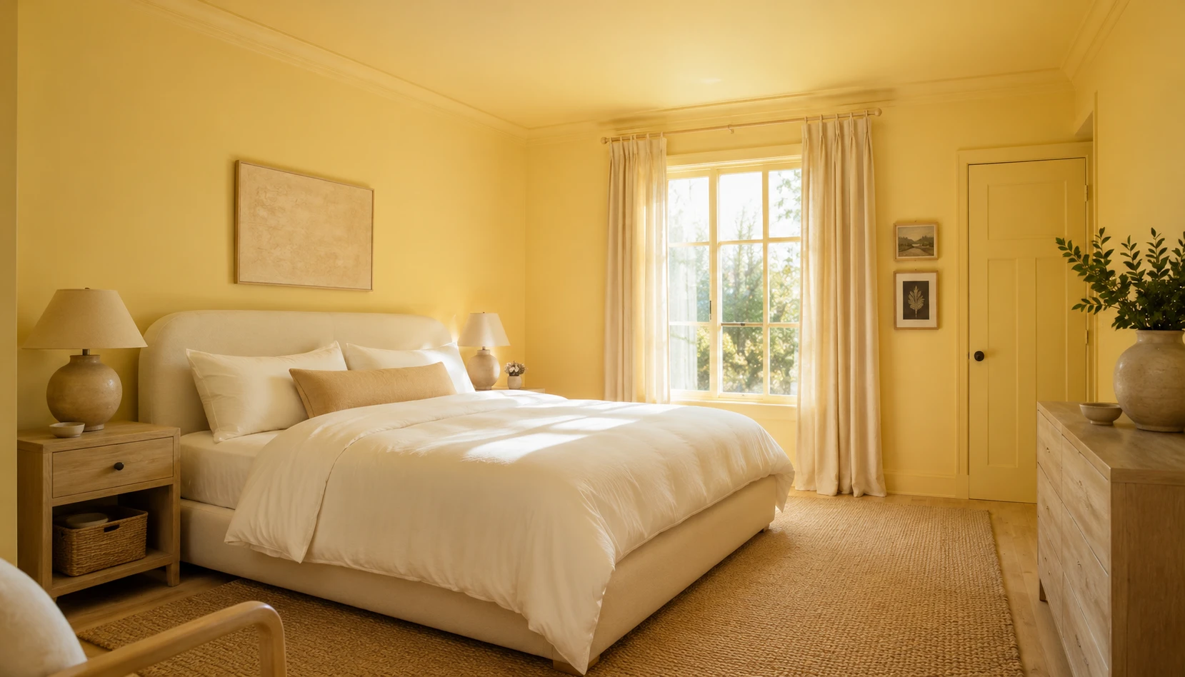
For anyone ready to fully commit, painting an entire bedroom in butter yellow creates an immersive, cocooning effect. It’s about the closest paint gets to waking up inside a sunrise.
The full color drench. Paint the walls, ceiling, trim, and even the doors in the same butter yellow shade for a completely enveloping effect. This technique, sometimes called color drenching, removes visual breaks and makes the room feel larger and more intentional. You end up wrapped in warmth from every angle.
The classic walls-only approach. Paint the walls butter yellow while keeping the ceiling and trim crisp white. This is the safest and most versatile option, offering warmth without the full commitment of color drenching, and it works in bedrooms of any size.
The accent wall approach. Paint only the wall behind your bed in a deeper butter yellow while keeping the remaining walls white or cream. This creates a warm focal point and frames the bed beautifully without overwhelming the room.
Balancing full yellow walls. If you commit to full walls, balance the saturation with plenty of white or cream in your bedding, curtains, and larger furniture pieces. This prevents the room from feeling too heavy and keeps the overall mood calm rather than overstimulating.
Trim and architectural details. Crisp white trim, door frames, and window casings against butter yellow walls create definition and a fresh, classic look. Alternatively, painting trim in the same butter yellow for a seamless tone-on-tone effect feels more contemporary and cocoon-like.
Renters and temporary solutions. If you can’t paint, butter yellow peel-and-stick wallpaper gives the same warm effect. Apply it to a single accent wall, or even the ceiling for a wallpaper box effect that wraps the room in pattern and color.
Butter yellow walls are a bold choice, but a rewarding one. Done well, they turn a bedroom into a genuinely warm, personal retreat.
Butter Yellow Through Bedding
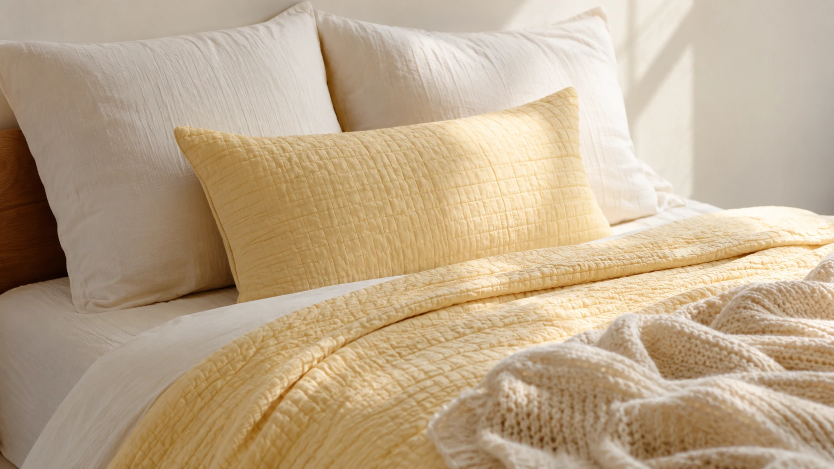
If painting feels like too much commitment, bedding is the easiest and most affordable way to bring butter yellow into your bedroom. Since the bed is the largest surface in most bedrooms, changing the bedding changes the entire room instantly.
The simple bedding formula. Start with crisp white or warm cream sheets as your base. Layer a butter yellow quilt, coverlet, or duvet cover on top. Finish with two or three cream or white pillows and one butter yellow accent cushion.
Pattern options. Butter yellow works beautifully in solids, but also in gentle patterns. Soft gingham, delicate stripes, or small florals in butter yellow and cream add texture and visual interest without overwhelming the palette.
Layering with texture. A chunky cream knit throw folded at the foot of the bed, paired with butter yellow linen pillowcases, creates the layered, tactile look that makes bedding feel intentional rather than matched from a set.
Seasonal flexibility. Butter yellow bedding feels especially fresh in spring and summer. If you want year-round flexibility, choose a butter yellow quilt or throw that can be swapped for deeper tones in cooler months while keeping your base sheets neutral.
The accent-only approach. For the lightest touch, skip yellow bedding entirely and add just one or two butter yellow cushions to an otherwise white or cream bed. This introduces the color as a gentle accent rather than a dominant feature.
Where to shop the look. Look for organic cotton percale sheets, European linen duvet covers, and washed gauze blankets in butter yellow or cream. Natural fabrics like linen and cotton hold the buttery tone well and soften with each wash.
Bedding is the easiest way into butter yellow. It requires no permanent commitment and can be refreshed each season as your taste changes.
Butter Yellow and Cream: The Safest Combination
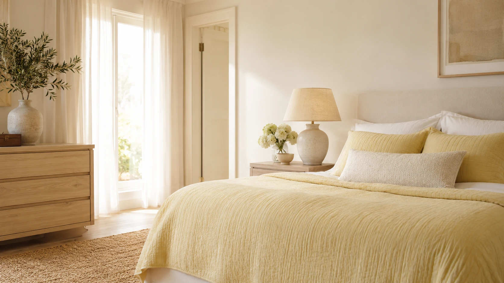
Pairing butter yellow with cream is close to foolproof. Because the two colors sit so close on the warm neutral spectrum, the pairing creates a soft, tonal look that feels calm rather than busy.
The tonal layering technique. Use several different shades within the cream-to-butter-yellow range throughout the room, a cream wall, a butter yellow bedspread, an oat-toned rug, a pale yellow lampshade. This layered tonal approach creates depth without introducing contrast that could feel jarring.
Why this pairing feels expensive. Tonal color schemes, where colors sit close together rather than contrasting sharply, tend to read as more considered. The eye takes in the room as cohesive rather than busy.
Building the palette. Cream walls or bedding as your largest surface. Butter yellow as a secondary layer through a throw, cushions, or curtains. A few deeper cream or oat tones in a rug or upholstered chair to ground the palette.
Adding warmth with materials. Natural linen, cotton, and light wood all sit well within this tonal cream and butter yellow world, since the materials share the same warm, soft quality as the colors themselves.
Best for light-filled rooms. This combination shines especially in bedrooms with good natural light, where the tonal warmth glows rather than feeling flat. In darker rooms, ensure at least one element, a lamp, an accent wall, provides enough contrast to keep the space from feeling monotone.
This is about as safe as butter yellow gets, and a good starting point if you’re not ready to commit to a bolder color statement.
Butter Yellow and Sage Green
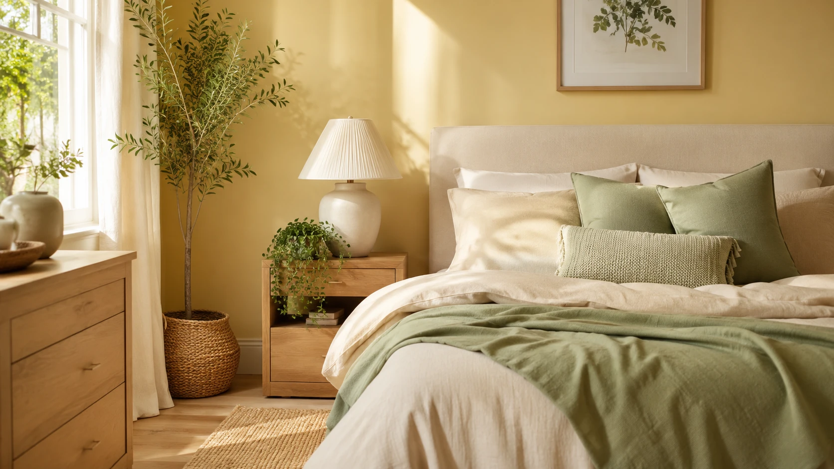
Butter yellow and sage green is a natural pairing, close to the colors of new spring growth: daffodils against soft foliage. Together they feel fresh and calming.
Why this pairing works. Sage green’s muted, earthy quality keeps butter yellow from feeling too sweet or saturated. In return, butter yellow brings warmth and brightness to sage green, which can sometimes feel cool or muted on its own.
Building the combination. Butter yellow walls or bedding as the primary color. Sage green introduced through cushions, a throw blanket, or a single accent chair. Real plants reinforcing the green tones and adding life to the room. See our Sage Green Bedroom Ideas for more on working with this color if you want to explore a sage-led version of this palette.
The 70-30 approach. Let one color lead. Either butter yellow dominates with sage as a supporting accent, or sage green leads with butter yellow as the warm pop. Splitting the two colors evenly can feel less resolved than committing to one as primary.
Natural materials complete the look. Light oak furniture, jute rugs, and woven baskets support both colors beautifully, since both butter yellow and sage green share an organic, nature-inspired quality.
Adding a third neutral. Cream or warm white as a base color prevents the yellow and green from competing for attention, giving both colors room to breathe within a calm, neutral foundation.
This combination works especially well if you want the bedroom to feel like a sunlit garden: warm and grounded at once.
Butter Yellow and Terracotta
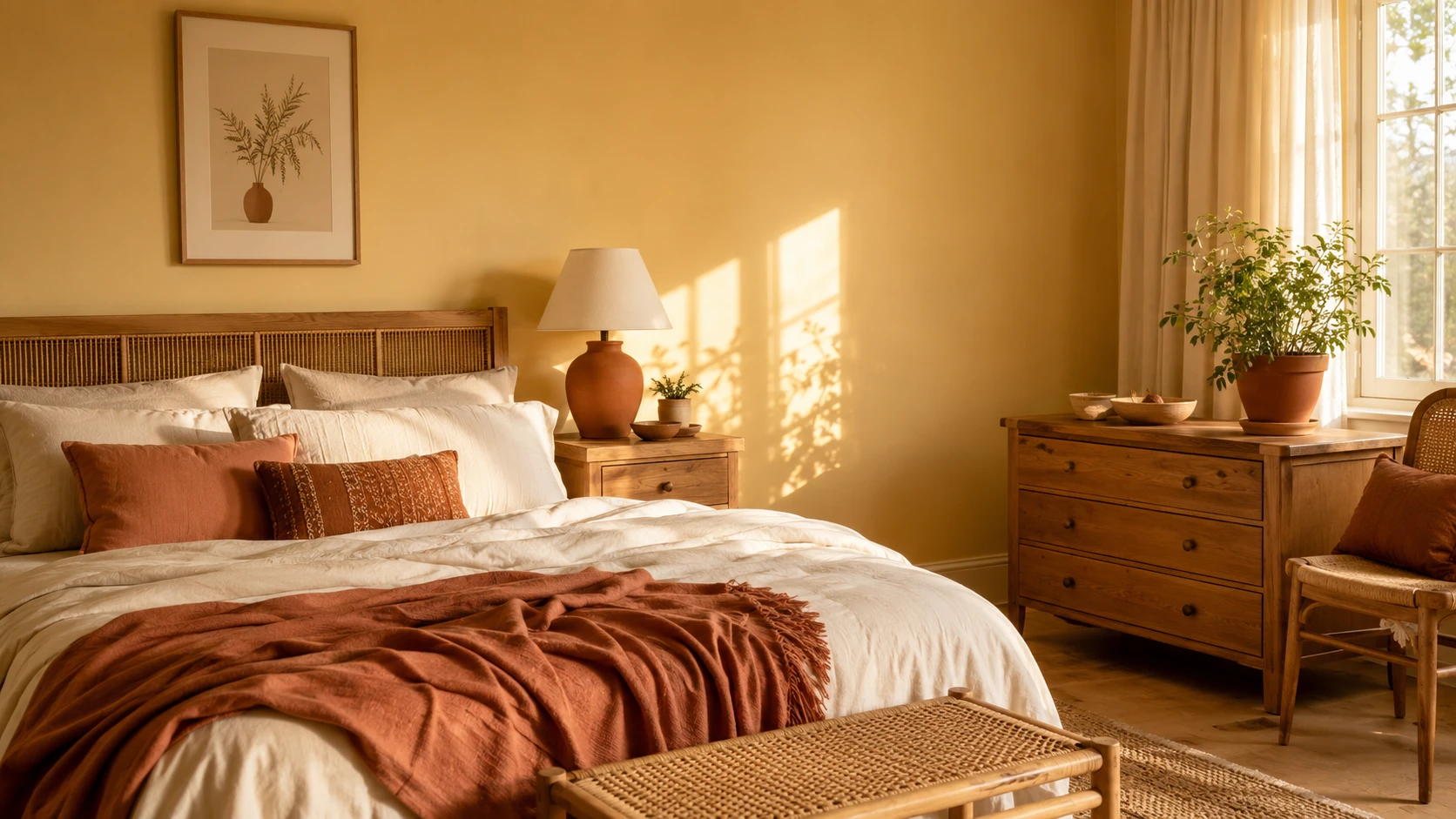
Butter yellow and terracotta share a warm, sun-drenched quality, so they never feel like a stretch together. Combined, they create a rich, earthy bedroom palette that calls to mind golden hour light on clay and stone.
How the pairing works. Both colors sit on the warm side of the spectrum, meaning they never fight each other the way a warm and cool color combination might. Terracotta adds depth and grounding weight, while butter yellow keeps the palette feeling light and optimistic rather than heavy.
Building the look. A butter yellow wall or bedding base. Terracotta introduced through a ceramic lamp base, a clay-toned throw, or accent cushions. Natural wood furniture bridging both colors with its own warm undertone.
The pottery connection. Terracotta’s connection to handmade clay pottery pairs beautifully with butter yellow’s soft, organic quality. Ceramic vases, ceramic lamp bases, and ceramic bowls in terracotta tones feel like natural accessories in this palette. Our White and Terracotta Bedroom Ideas guide has more on working with terracotta tones if you want a terracotta-led approach.
Balance is essential. Because both colors are warm and saturated, balance them with generous cream or white space. Too much butter yellow and terracotta together without a neutral buffer can feel overwhelming rather than warm.
Best styling accents. Brass hardware and lighting enhance both colors beautifully. A woven jute rug and linen curtains support the earthy, sun-warmed feeling that defines this combination.
This pairing feels especially rich in the golden light of early morning or late afternoon, when both colors seem to glow.
Butter Yellow and Navy Blue
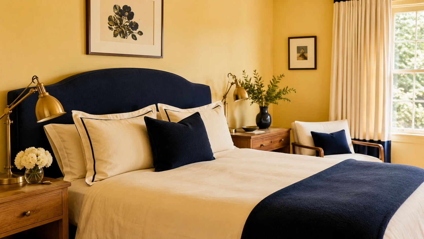
For those wanting a bolder statement, butter yellow paired with navy blue creates a striking, sophisticated contrast. This combination feels classic and confident, avoiding the sweetness that yellow alone can sometimes carry.
Why this pairing feels sophisticated. Navy is a deep, grounding color that gives butter yellow structure and gravity. Where sage or cream soften yellow, navy sharpens it into a more graphic, intentional look.
Building the combination. Butter yellow walls with a navy upholstered headboard or bed frame. Or, invert it, navy walls with butter yellow bedding as the bright accent. Both directions work depending on how bold you want the room to feel.
The 80-20 rule for contrast pairings. With a higher-contrast combination like this, let one color clearly dominate at roughly eighty percent of the room, with the other appearing at twenty percent as an accent. This prevents the pairing from feeling like two competing color schemes.
Best accent placement. A navy throw blanket at the foot of a butter yellow bed. Navy piping on cream or yellow cushions. A navy ceramic lamp base on a butter yellow nightstand. Small, considered touches keep the contrast elegant rather than overwhelming.
Metals that complete the look. Brass and gold hardware bridge both colors beautifully, adding warmth to the navy and richness to the yellow simultaneously.
This combination suits a bedroom that wants a more dramatic statement, while still keeping the warmth that butter yellow brings.
Natural Wood and Texture in a Butter Yellow Room
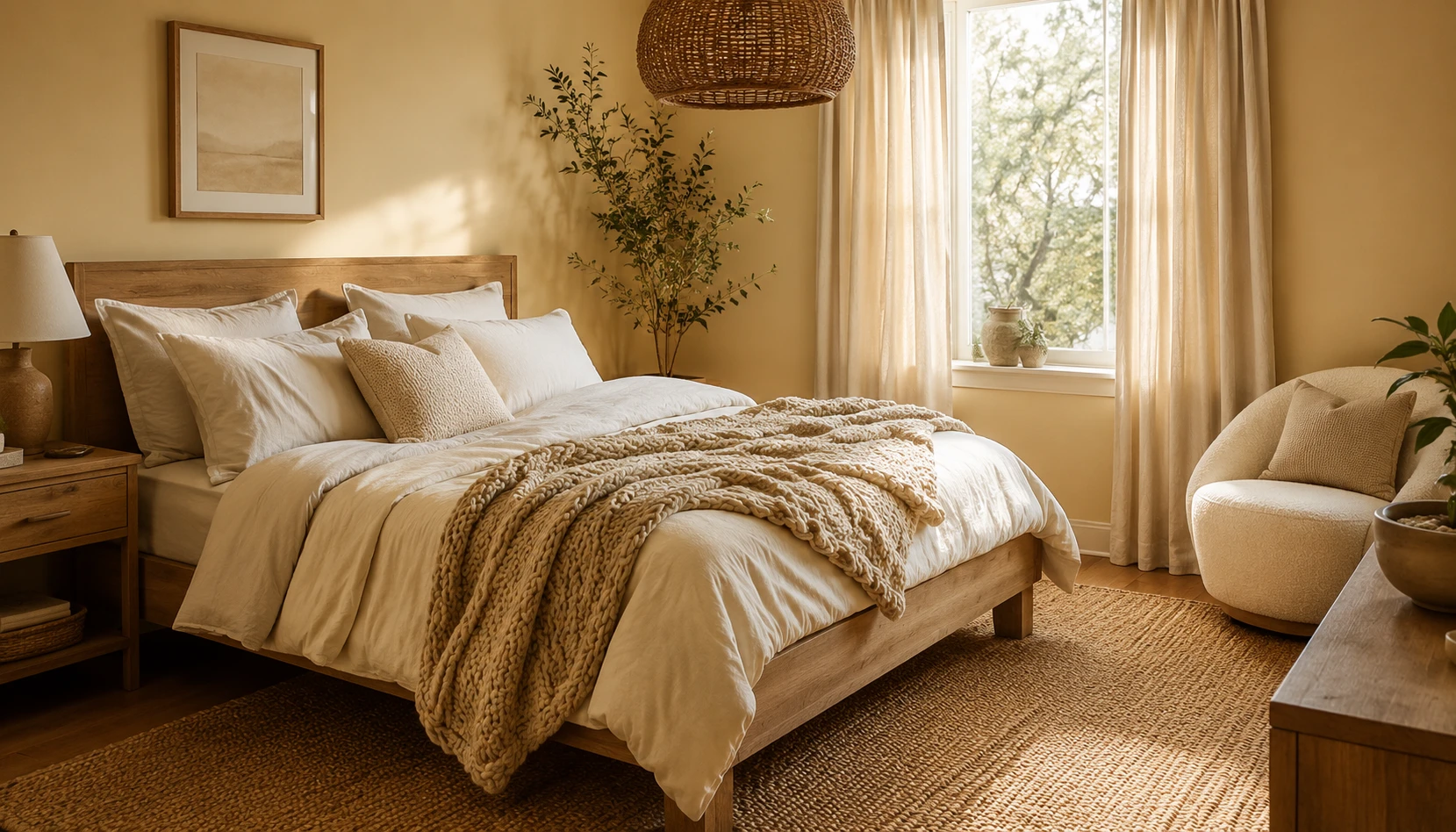
Butter yellow looks best paired with natural wood and layered textures. Those organic materials keep a butter yellow bedroom feeling grounded and warm rather than flat or overly sweet.
Best wood pairings. Light oak brings a fresh, Scandinavian quality that keeps the room feeling airy. Warm walnut adds richness and a more grounded, classic feel. Both wood tones share butter yellow’s inherent warmth, so neither ever fights the color.
Layering textures. Mix linen, cotton, boucle, and woven jute to add depth. A linen duvet cover, a boucle accent chair, a jute rug, and a chunky knit throw together create the tactile richness that makes a butter yellow room feel finished rather than flat.
Woven and natural accents. Rattan headboards, woven pendant lampshades, and cane furniture details all complement butter yellow’s soft, organic character and add to the sun-warmed feel of the palette.
Avoiding a flat look. A room that is entirely smooth surfaces and solid colors, even in a beautiful shade like butter yellow, can feel unfinished. Texture is what elevates a color from a paint choice into a fully realized room.
Ceramic and ceramic-adjacent details. Handmade ceramic lamp bases, vases, and dishes in cream or terracotta tones add warmth and an artisanal quality that pairs beautifully with the softness of butter yellow.
Natural materials are what take a butter yellow bedroom from a color statement to somewhere you’d actually want to live.
Warm Lighting for a Butter Yellow Bedroom
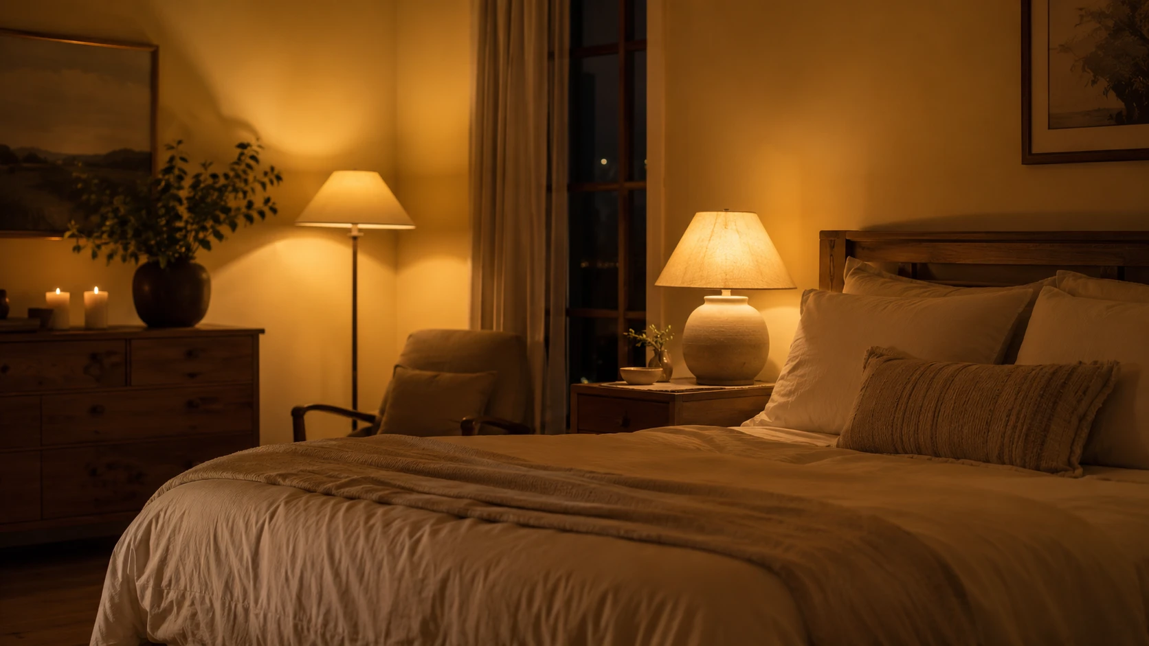
Lighting changes how butter yellow reads in a bedroom more than people expect. Warm lighting brings out the color’s natural glow, while cool lighting can make it look flat or slightly green.
Bulb temperature matters most. Use warm white bulbs in the 2700K to 3000K range throughout the bedroom. Cool white bulbs above 4000K clash with butter yellow’s warm undertone and can make the color read dull or slightly off.
Layer your light sources. A single overhead light is never enough. Add bedside lamps with fabric shades in cream or butter yellow, a floor lamp in a reading corner, and if possible, a dimmer switch for the main fixture.
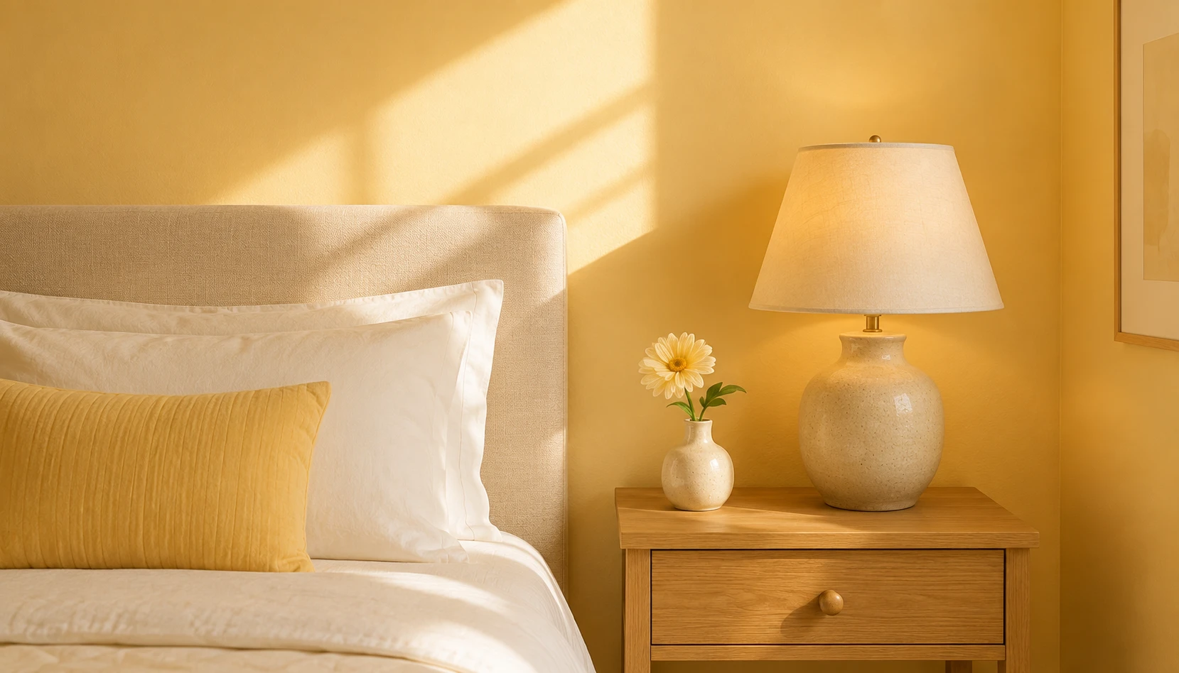
Fabric lampshades enhance the glow. A cream or pale yellow linen lampshade diffuses light beautifully, casting a warm, golden glow that echoes the wall color and makes the whole room feel like it is lit from within.
Candlelight for evening atmosphere. A few candles on the nightstand or dresser add flickering warm light that makes butter yellow walls glow even more after dark. It’s a small touch, but it makes the room feel genuinely cozy.
Natural light considerations. Sheer cream or white curtains let in maximum natural light during the day while diffusing direct sun, which can otherwise make a fully yellow room feel too intense at midday.
Brass and gold fixtures. Metal finishes with warm undertones, brass, gold, and aged bronze, complement butter yellow far better than cool chrome or silver.
Get the lighting right and butter yellow stops being just a paint color. It becomes the thing that makes the room glow.
Butter Yellow in Small Bedrooms
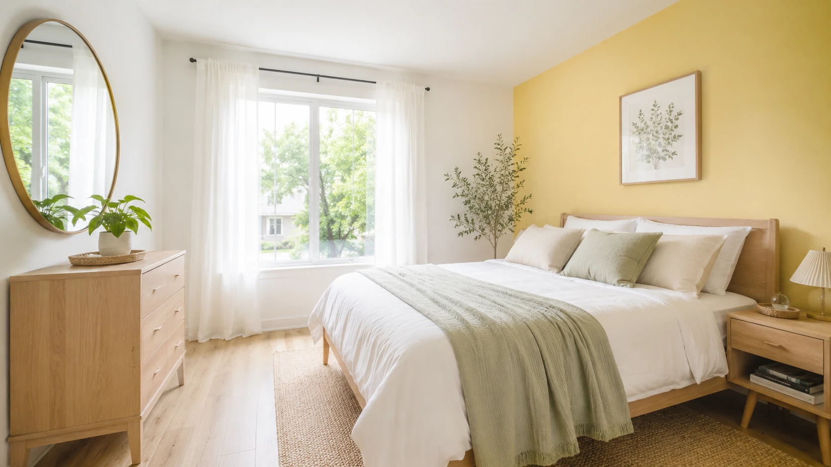
Small bedrooms can absolutely embrace butter yellow, but the approach requires a bit more care to keep the space feeling open rather than closed in.
Choose a paler shade. In small rooms, lean toward the palest end of the butter yellow spectrum, closer to warm cream with just a whisper of yellow. This adds warmth without absorbing too much light.
Use yellow as an accent, not a wash. Rather than painting every wall, introduce butter yellow through bedding, a single accent wall, or curtains, while keeping the remaining walls white or cream to preserve a sense of openness.
Maximize reflected light. A large mirror positioned opposite a window bounces natural light around the room, which is especially valuable in a butter yellow space, since more light means the color glows rather than feels flat.
Keep furniture light and low. Light wood furniture with visible legs, rather than bulky solid pieces, keeps a small butter yellow bedroom feeling airy. See our Room Decoration Ideas for Small Spaces for more small-space furniture strategies.
White trim for definition. Crisp white trim and ceiling against butter yellow walls create a clear boundary that helps the room read as organized and intentional rather than enclosed by a single overwhelming color.
Vertical elements. Floating shelves and tall, narrow furniture pieces draw the eye upward, which helps counteract any sense of a small room feeling boxed in by a strong wall color.
Butter yellow can make a small bedroom feel like a warm, sunlit retreat rather than a cramped space, as long as the shade stays light and the styling stays uncluttered.
Common Butter Yellow Bedroom Mistakes
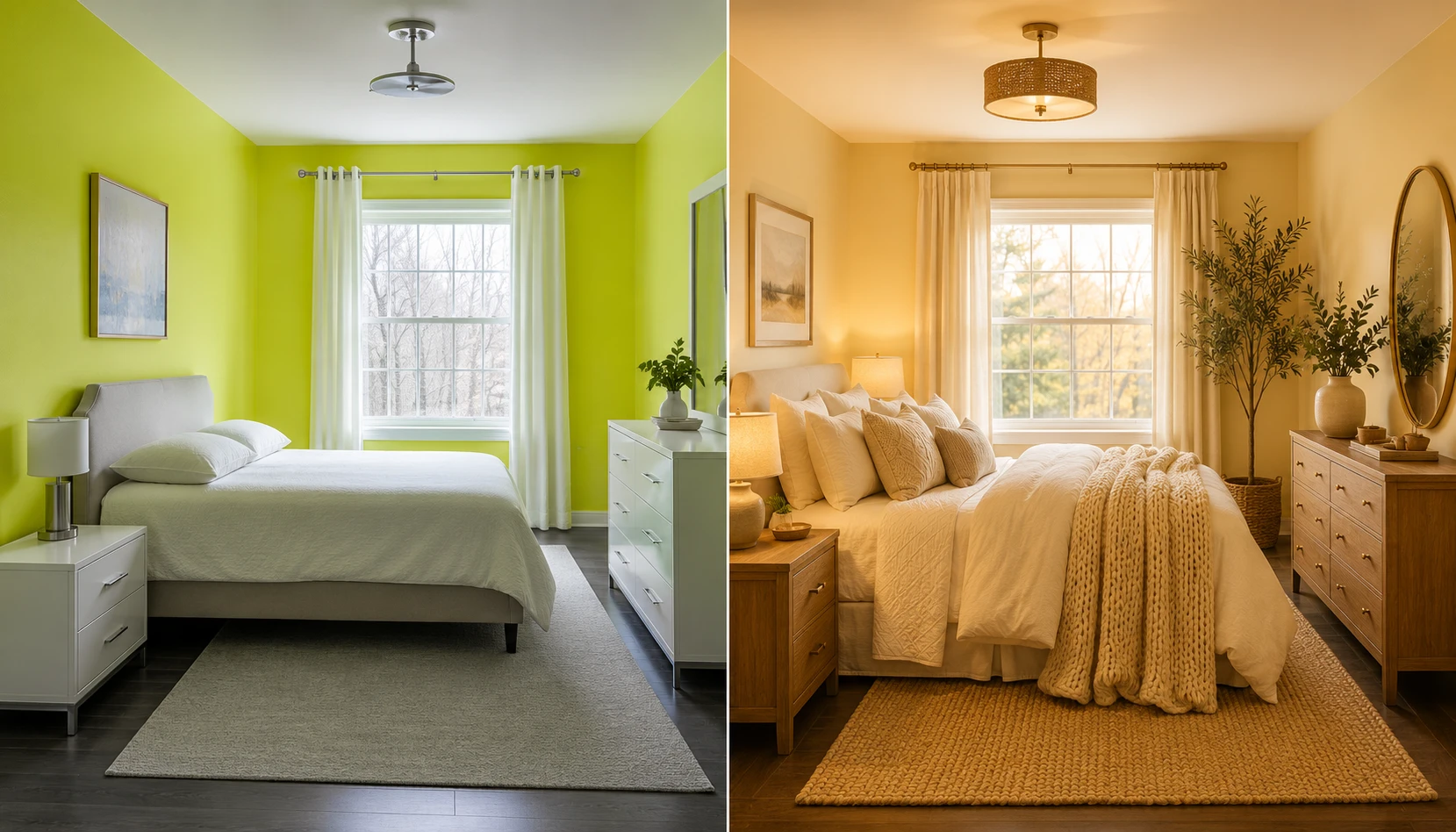
Even a beautiful color like butter yellow can go wrong with the wrong choices. Here are the mistakes to watch for.
Mistake 1: Choosing a shade that is too bright. True lemon or acid yellow reads as sharp and energizing rather than warm and restful, and it works against the calm mood a bedroom needs. Choose a muted, buttery tone instead.
Mistake 2: Using cool white lighting. Cool bulbs clash with butter yellow’s warm undertone, making it look dull or slightly green. Stick to warm bulbs in the 2700K to 3000K range throughout the room.
Mistake 3: No neutral buffer. Pairing butter yellow with other saturated colors without enough cream or white space can feel overwhelming. Always give the palette room to breathe.
Mistake 4: Skipping the sample stage. Butter yellow shifts dramatically with light throughout the day. Never commit to a full room without sampling the paint in your actual space across morning, midday, and evening light.
Mistake 5: Cold-toned furniture and metals. Grey-washed wood and chrome or silver fixtures fight butter yellow’s warmth. Choose warm wood tones and brass or gold metals instead.
Mistake 6: Flat, textureless styling. A butter yellow room with no textural variation, no linen, no wood grain, no woven elements, can feel flat despite the beautiful color. Layer materials generously.
Mistake 7: Overcommitting in a small dark room. A deep, saturated butter yellow in a small room with little natural light can feel heavy rather than warm. In these spaces, lean toward the palest shades or use yellow only as an accent.
Mistake 8: Ignoring undertones. Some butter yellows lean slightly green, others slightly orange. Compare undertones carefully against your existing furniture and flooring to avoid an unexpected clash.
Butter yellow doesn’t feel like a passing trend. Bedroom design has been moving toward more warmth and personality generally, and butter yellow fits right into that. Whether you commit fully with color-drenched walls or just add it through a cushion and a ceramic lamp base, it brings a kind of sunlit warmth that’s hard to get from most other colors.
Start with one element (a throw, an accent wall, a full bedding refresh) then build outward with cream, natural wood, and warm lighting. Do that and you end up with a bedroom that feels cheerful and calm rather than one or the other.
For more bedroom color inspiration see our guides on Sage Green Bedroom Ideas, White and Terracotta Bedroom Ideas, and Room Decoration Ideas for Small Spaces.