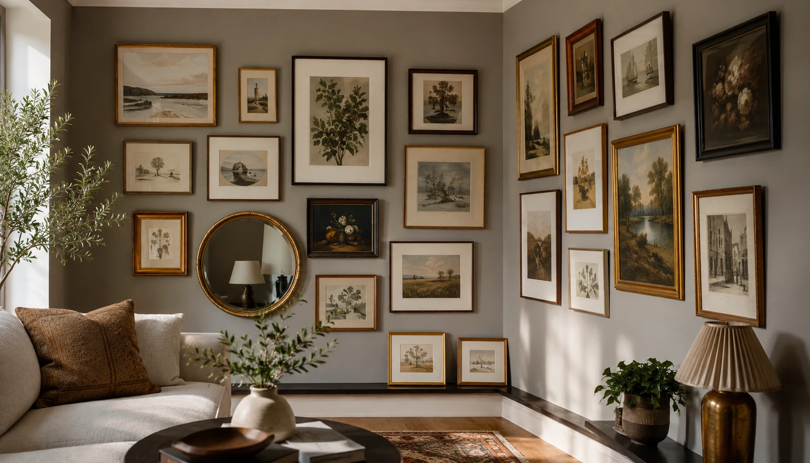
Almost every gallery wall guide out there assumes the same thing, one big, flat, uninterrupted wall to work with. A lot of homes don’t have one. What they have instead is a corner, the awkward kind where two walls meet at an angle you can’t photograph straight on, and it tends to get left empty for years because nothing in the standard advice applies to it.
A corner isn’t a smaller version of a flat wall. It has a seam running through the middle of your composition, two different light sources hitting it from two directions, and frames that have to work from more than one viewing angle at once. None of that means it can’t hold a gallery wall. It just means the rules are slightly different, and most advice never bothers to say so.
These 15 ideas are built specifically around that seam, not around pretending it isn’t there.
Start With the Largest Piece First
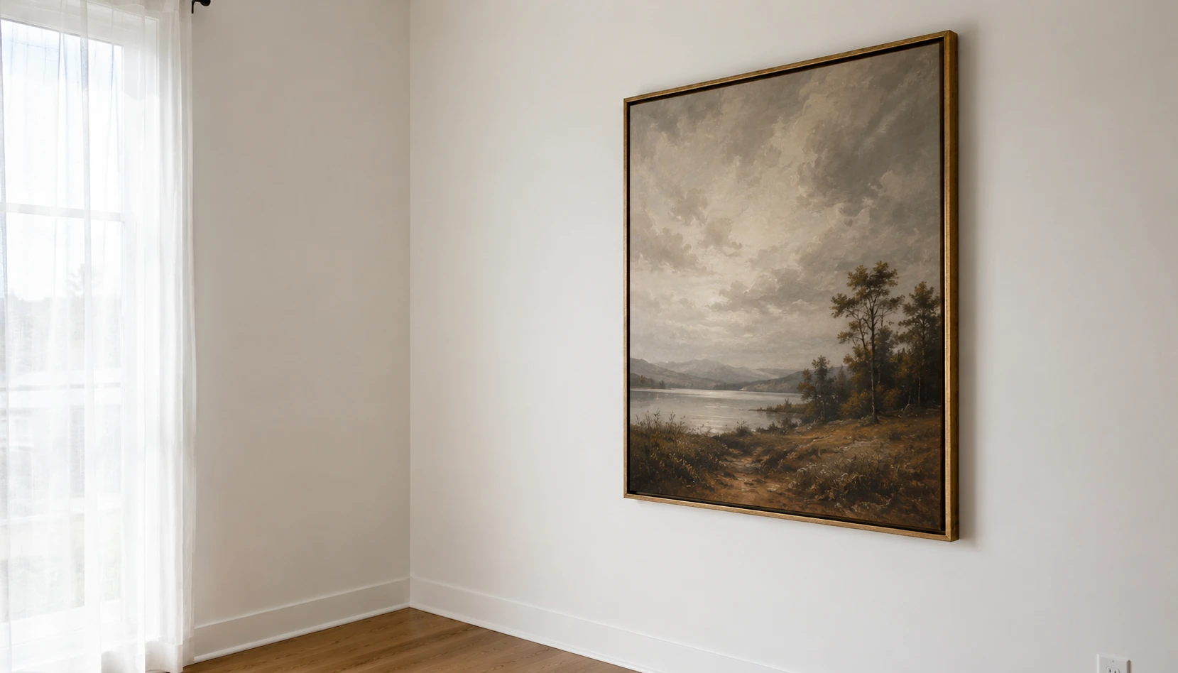
Place your biggest frame on the wall that gets the most direct sightline, usually the one you see first walking into the room. Everything else in the arrangement gets sized and placed relative to this one piece, not the other way around.
Working corner-first instead of largest-first is a common mistake in early attempts at this. Starting tucked into the seam and building outward tends to leave the whole thing lopsided, since the anchor piece ends up fighting for space it doesn’t have. Start big, start visible, then work into the corner from there.
If you don’t have one obviously large piece, a mirror or a slightly oversized print works just as well as an anchor. The point isn’t the specific object, it’s giving the whole arrangement one clear starting point instead of a dozen equally-weighted pieces with no hierarchy.
Build Outward From an Anchor Point
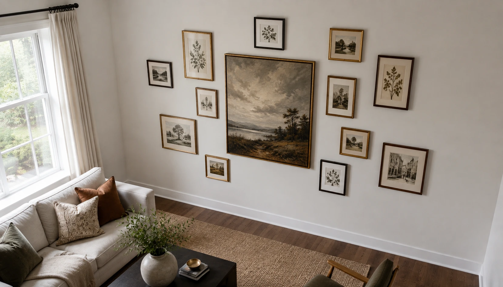
Once the anchor piece is up, work outward in both directions rather than filling one wall completely before touching the other.
Alternate sides as you add pieces, one on the main wall, one starting to wrap the corner, back to the main wall. This keeps the whole arrangement feeling connected across the seam instead of reading as two separate galleries that happen to share a corner.
Keep a consistent gap, somewhere between two and four inches works for most frame sizes, and measure it as you go rather than eyeballing each new addition against the last one. Small gap inconsistencies are invisible piece by piece and very visible once the whole thing is up.
The corner itself should have the tightest spacing in the whole arrangement, tighter than you’d use anywhere else on a flat wall. That tightness is what visually stitches the two walls back together instead of leaving a gap that reads as a mistake.
Mix Frame Sizes and Shapes on Purpose
Uniform, matching frames work beautifully on a flat wall. In a corner, they tend to look thin and repetitive, since the eye has less flat space to appreciate the repetition.
Mix at least three different sizes and two different shapes. A round mirror next to a tall rectangular print next to a small square frame reads as intentional variety. Three identical rectangles at slightly different heights just reads as a smaller version of a flat gallery wall that ran out of room.
One round or oval piece is genuinely worth working into almost every corner arrangement. The curve breaks up all the straight edges meeting at that seam and softens what is otherwise a very geometric, angular spot in the room.
Leave your smallest pieces for right at the corner itself. Large frames need real wall space to breathe, which the seam doesn’t have much of.
Let a Single Wall Color Do the Work
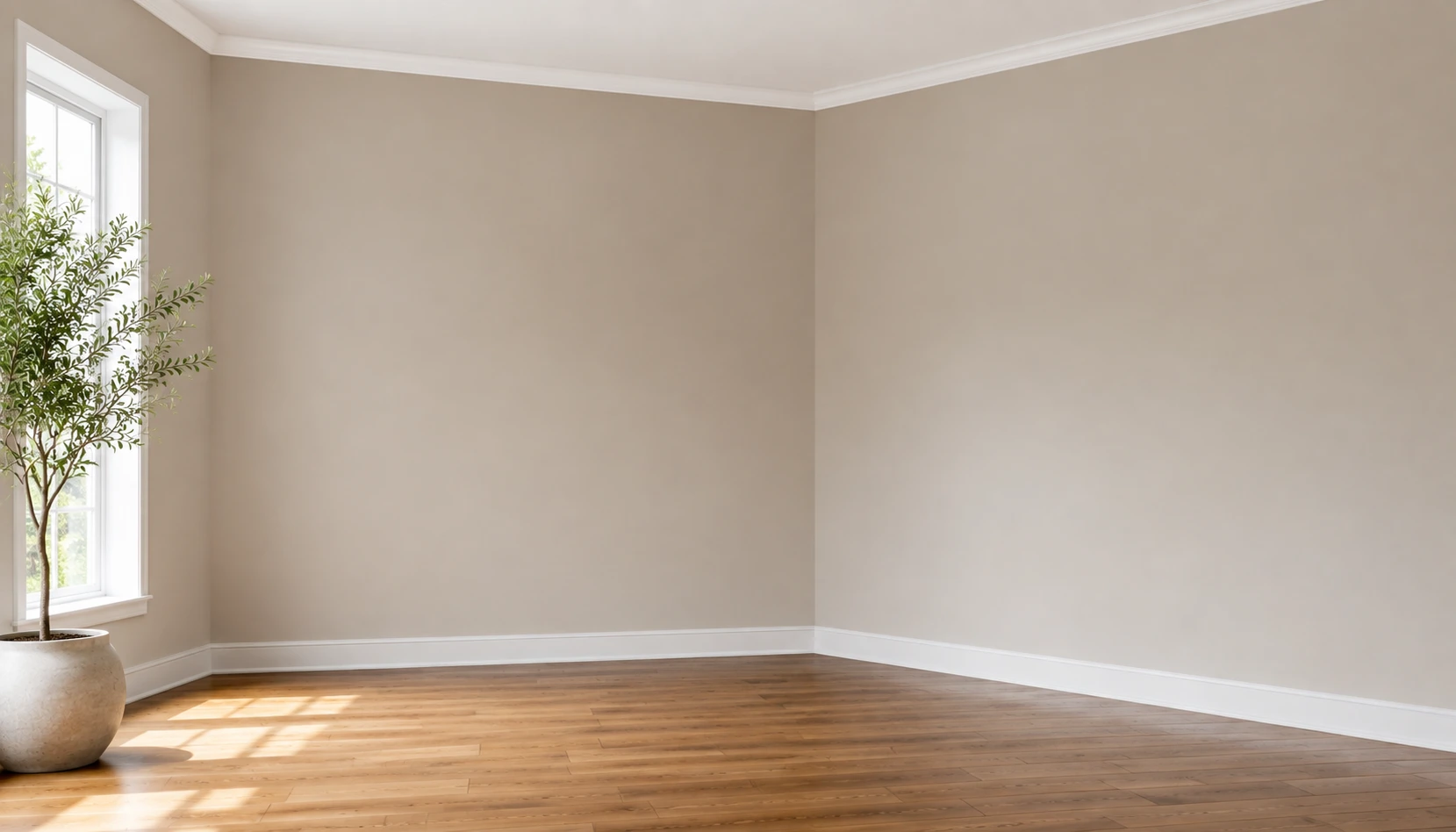
Paint both walls of the corner the exact same color, not just a similar one. Even a slightly different shade between the two walls draws attention to the seam in a way that undercuts the whole point of the gallery wrapping around it.
A soft neutral, warm white, or light greige gives the widest range of frame colors somewhere to sit without a fight. If you want a bolder wall color, this is one of the few spots in a home where a darker, moodier tone genuinely helps rather than competes, dark walls make lighter mat boards and frames pop more than a pale wall does.
Skip wallpaper or a strong pattern behind a corner gallery specifically. The seam already creates enough visual complexity on its own, and a patterned background fights with both the frames and the corner itself for attention.
Choose Vertical or Diagonal Layout Lines
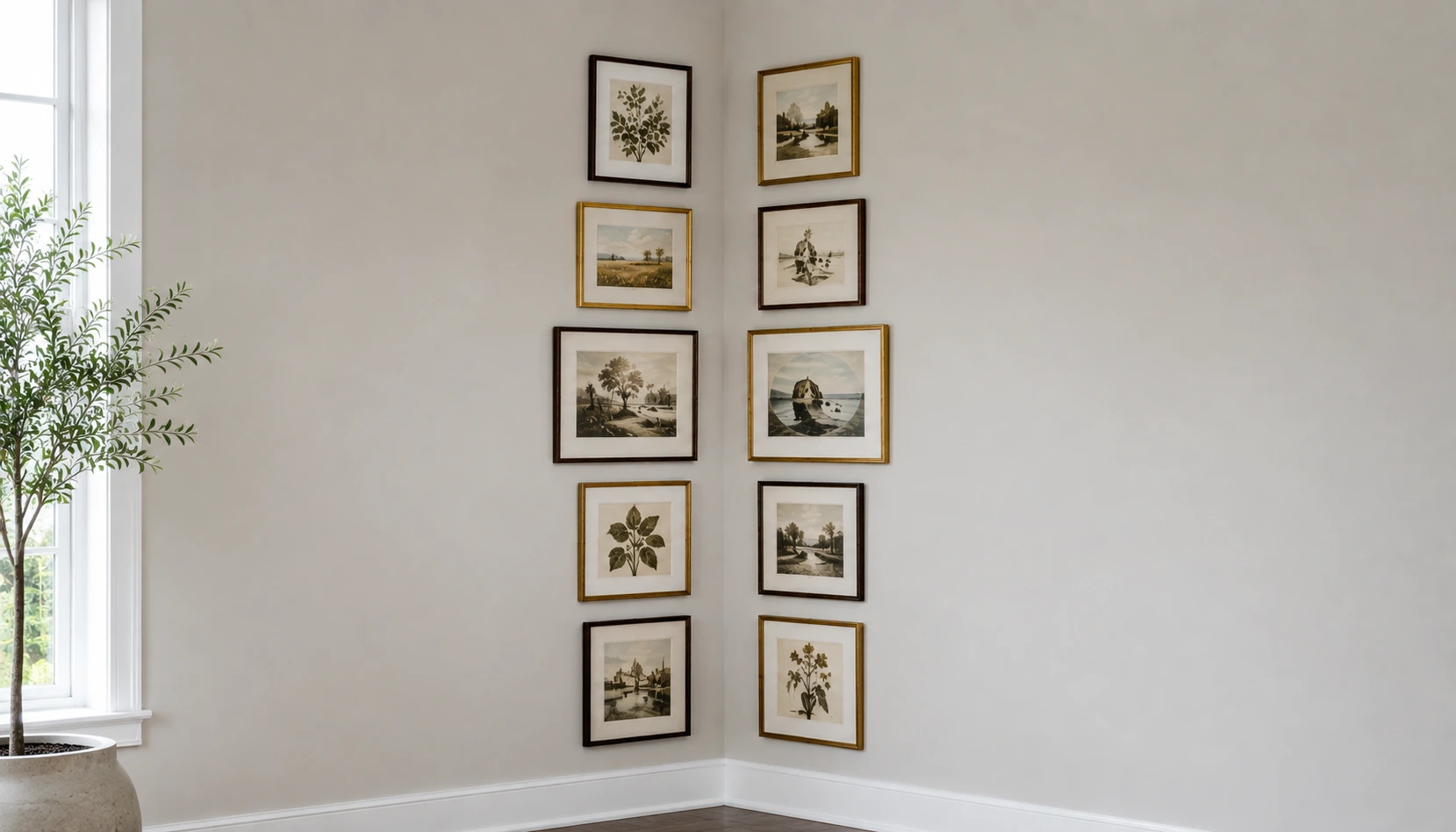
A strict horizontal row, the classic flat-wall gallery layout, tends to look strange wrapping a corner, since the row has to visually break at the seam no matter how carefully you space it.
A vertical column climbing each wall, or a loose diagonal line running through the whole arrangement, both work with the corner’s geometry instead of against it. Two loose columns meeting at the seam tends to read as intentional in a way a horizontal row rarely manages, since the row has nowhere clean to break.
A diagonal line is a bit more advanced to pull off cleanly, since it needs consistent spacing on an angle rather than a straight edge to measure against. If you’re doing this for the first time, vertical columns are the more forgiving starting point.
Whichever line you choose, keep it consistent on both sides of the corner. Mixing a vertical line on one wall with a horizontal row on the other is what actually creates the mismatched look people are trying to avoid.
Bring In a Mirror
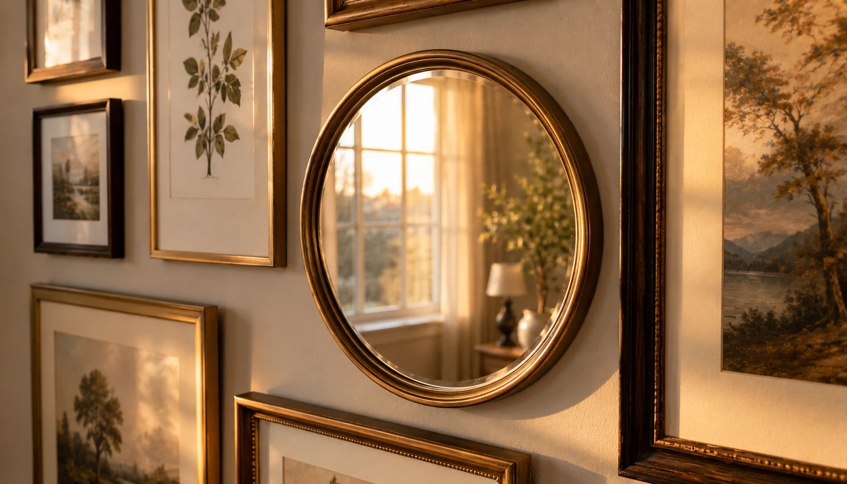
Corners frequently get less direct light than the center of a wall, simply because of where windows tend to sit in most room layouts. A mirror worked into the arrangement helps counteract that.
Position the mirror to reflect your room’s main light source, not a blank wall or the ceiling. Even a small mirror angled correctly adds a noticeable amount of bounced light back into a corner that would otherwise sit a little dim compared to the rest of the room.
Beyond the practical light benefit, a mirror is one of the easiest ways to introduce a different shape and material into an otherwise all-frame arrangement, which ties back to the mixing principle from earlier. A round mirror in particular does a lot of visual work for one object.
Keep the mirror smaller than your main anchor piece. A mirror that size-competes with your largest frame creates two anchor points instead of one, and the arrangement loses the clear hierarchy that makes it read as considered.
Add a Shelf or Ledge for Depth
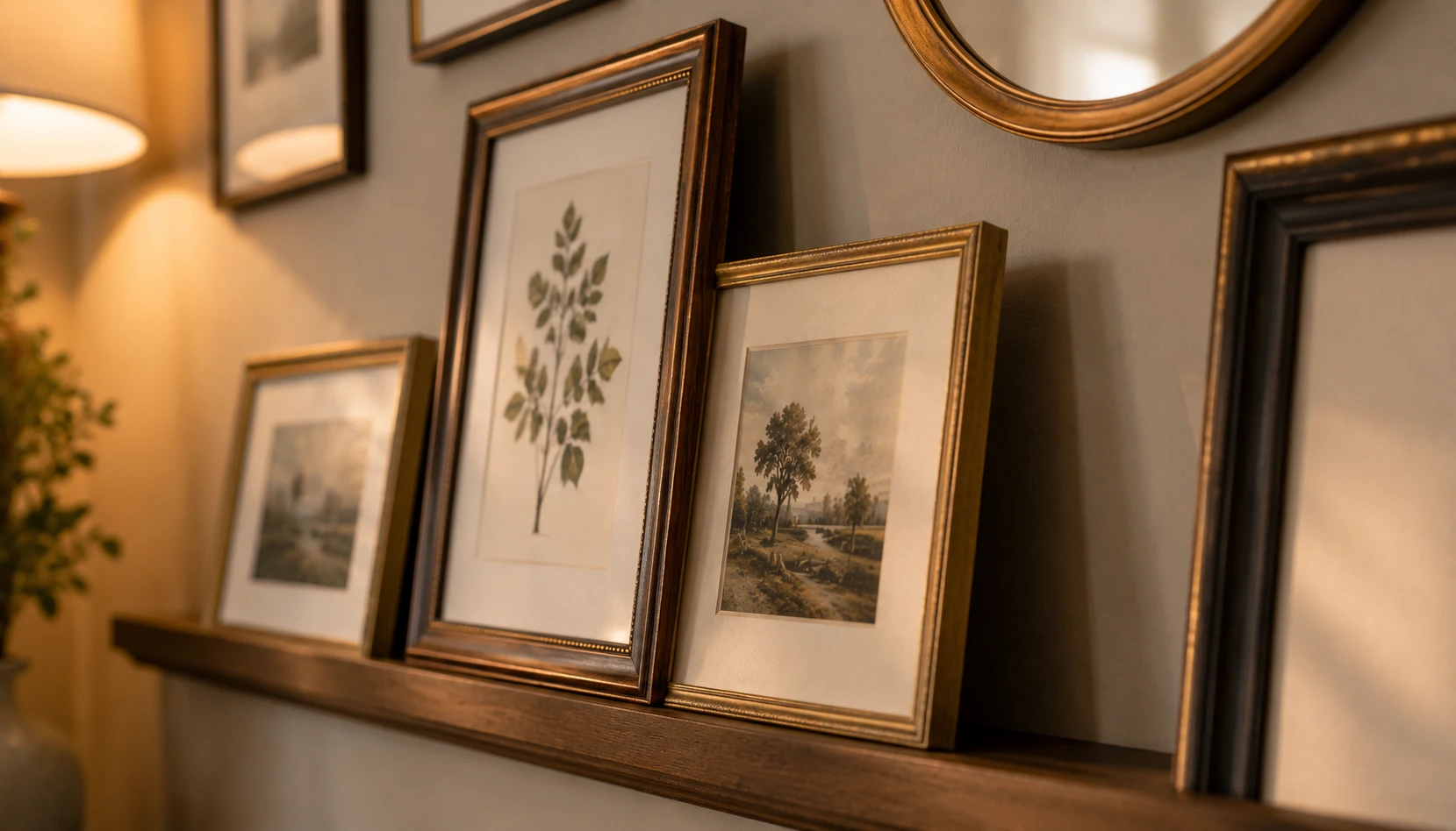
A picture ledge, even a narrow four-inch one, changes a corner gallery from purely flat hung frames into something with actual dimension.
Lean two or three smaller frames against each other on the ledge rather than hanging every single piece. This is a small detail, but leaning frames create natural overlap and shadow that a wall of flush-hung pieces doesn’t have, and it gives you an easy way to update the arrangement later without new nail holes.
A ledge also solves a real practical problem specific to corners: hanging a frame close enough to the actual seam is often awkward, since there’s rarely enough flat wall space right at the corner for a nail. A ledge running along the base of the arrangement sidesteps that problem entirely for at least a few pieces.
If you’re renting, a ledge is also one of the lowest-commitment ways to build a gallery wall at all, since most of your pieces can simply lean rather than require picture hooks.
Light the Corner Properly
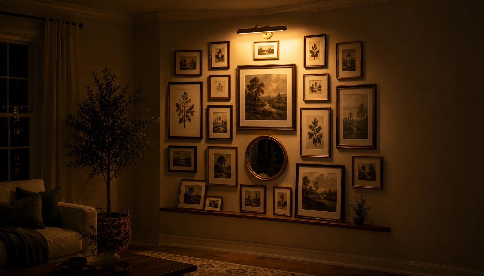
As mentioned earlier, corners often sit a bit outside a room’s main light path. Beyond a mirror, a real light fixture solves this more directly.
A small plug-in picture light or a warm-toned floor lamp positioned to wash light across the arrangement makes a real difference, especially in the evening when natural light isn’t doing any of the work anymore. Without it, a corner gallery can look great during the day and disappear into shadow by dinnertime.
Keep the bulb temperature warm, in the 2700K to 3000K range, matching the same principle that applies to small bathrooms and laundry closets on this site. A cool white light in a gallery wall setting reads as clinical rather than curated.
If running a cord to a corner outlet isn’t practical, a battery-operated picture light solves the same problem with genuinely minimal installation, a small stick-on fixture that runs for months on a charge.
Mix Art With Photos and Small Objects
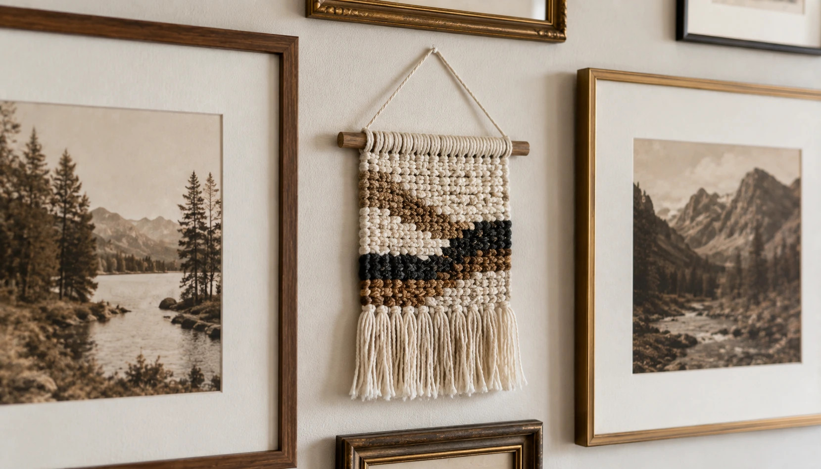
An arrangement made entirely of framed prints and photos, however well curated, can start to feel a little flat after a while, no pun intended.
Add one object that isn’t a frame at all, a small woven hanging, a single wall sconce, a small shelf with one object on it. This single addition does more to make the corner feel collected over time rather than assembled all at once from a single trip to the frame store.
Mixing genuinely personal photos in with purchased art or prints matters here too. A corner gallery built entirely from stock-feeling art prints can look like a showroom. One or two real photos, even casually framed, ground the whole thing and make it feel like your actual home rather than a display.
Keep this addition to one or two pieces at most. The point is a texture break, not a second competing focal point pulling attention away from your anchor piece.
Work With a Slanted Ceiling or Odd Angle
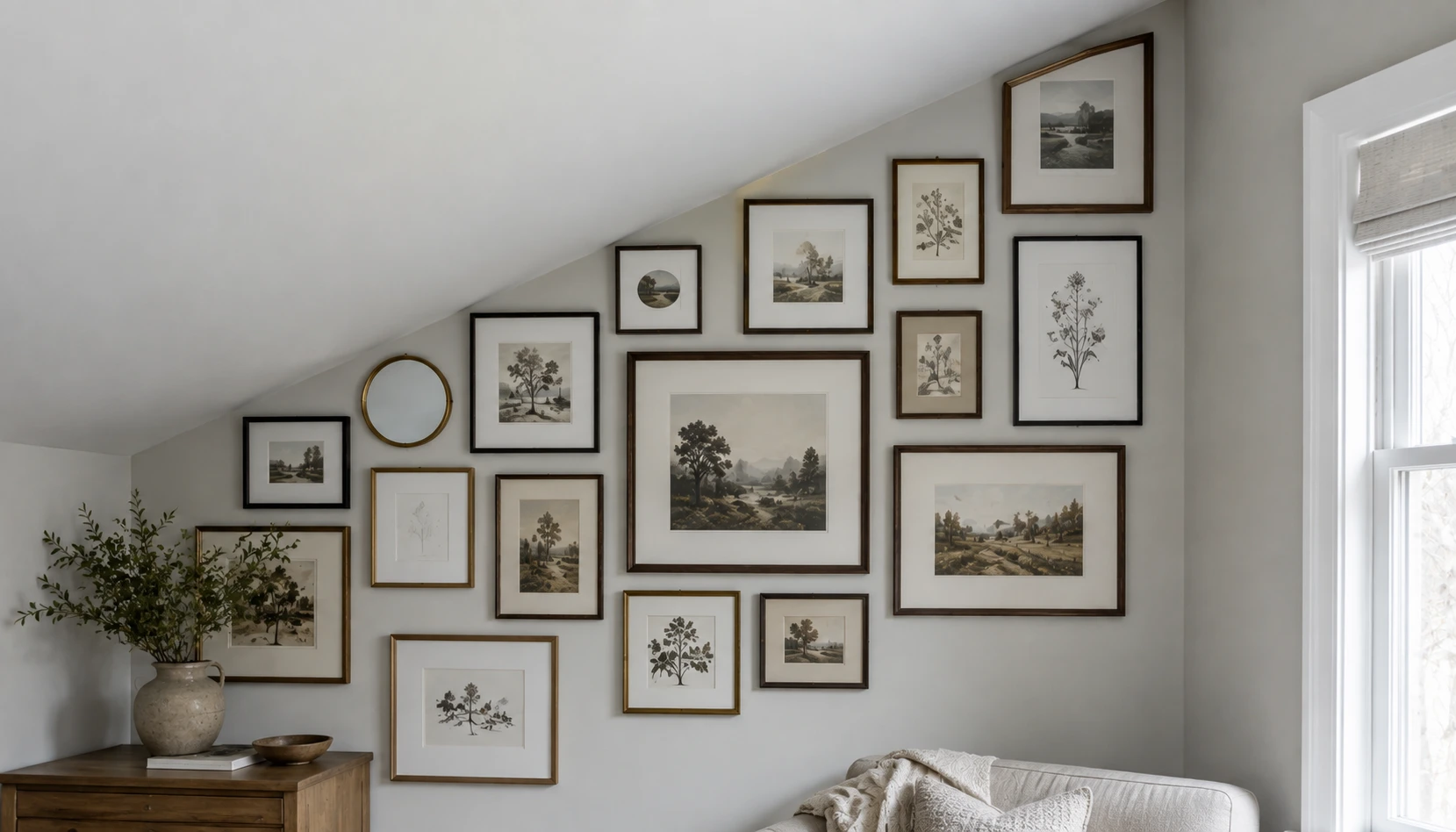
Some corners come with an added complication, a slanted ceiling, an odd structural angle, or a nearby door frame eating into the available space. None of that rules out a gallery here, it just changes the shape you’re working with.
Follow the slant with your top row rather than fighting it with a strict horizontal line. A staggered top edge that echoes the ceiling angle reads as intentional, while forcing a flat top line against a slanted ceiling creates an awkward triangular gap that draws the eye straight to the problem.
If a door frame or window is eating into one side of the corner, let the arrangement wrap asymmetrically rather than trying to force equal coverage on both walls. An asymmetrical corner gallery, weighted more heavily to whichever side actually has usable wall space, looks far more natural than a symmetrical one squeezed around an obstacle.
Measure the actual available angles before buying any frames. It’s a frustrating discovery to make after the fact that a favorite piece simply doesn’t fit the slant.
Keep Frame Finishes Cohesive
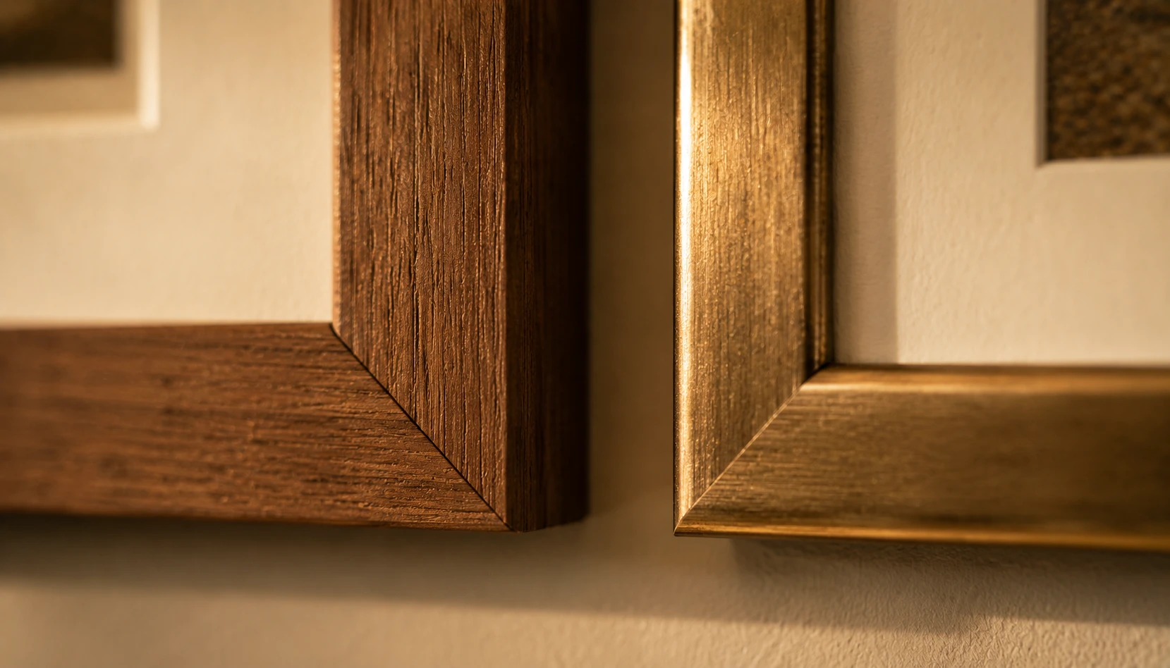
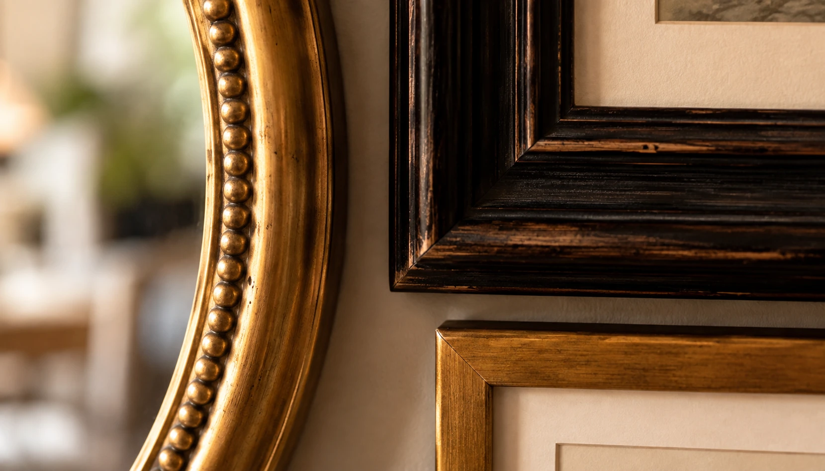
Idea 3 covered mixing sizes and shapes on purpose. Frame finish is the one place where that mixing instinct should stop.
Pick one or two coordinated finishes, warm wood and brass, or black and natural wood, and stick to them across every single piece. A gallery wall with black, gold, silver, and unfinished wood frames all in the same small arrangement reads as leftover frames rather than a considered collection, especially in a corner where everything sits closer together than it would on a flat wall.
This is the detail that most often separates a gallery wall that looks pulled together from one that looks accidental, and it’s also the cheapest to fix. A few dollars of spray paint on mismatched thrifted frames does more for the finished look than almost any other single change on this list.
If you’re building the collection slowly over time rather than buying everything at once, write your two chosen finishes down somewhere. It’s easy to drift from the original plan three purchases in.
Test the Layout on the Floor First
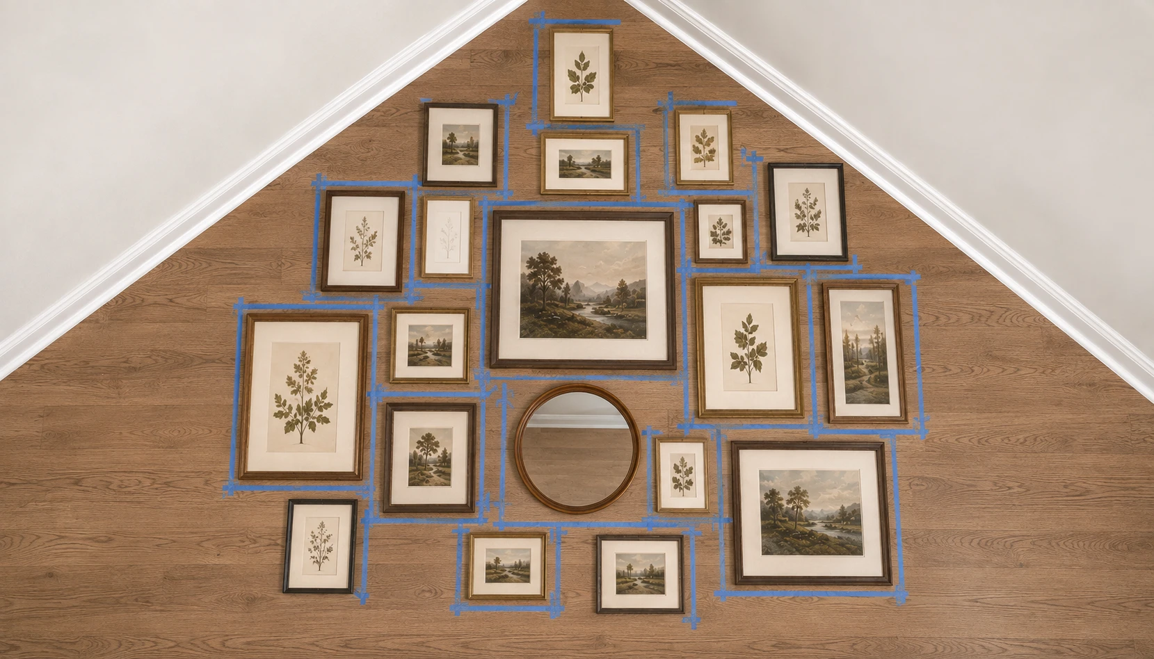
This is genuinely the single most useful piece of advice in this entire guide, and it’s the one people skip most often because it feels like an extra step.
Lay your full arrangement out on the floor, in the actual corner shape using tape or paper as a guide, before a single nail goes into the wall. A corner is harder to visualize than a flat wall specifically because you can’t step back and see the whole thing from one angle the way you can with a flat gallery wall.
Take a photo of the floor layout from above once you’re happy with it. This becomes your reference while hanging, since it’s easy to lose track of the exact spacing once you’re working vertically instead of looking down at a flat layout.
Skipping this step is the single most common reason a corner gallery ends up needing to be redone from scratch. It’s tedious for about twenty minutes and saves a genuinely frustrating afternoon of patched nail holes later.
Adjust for a Shallow vs Deep Corner
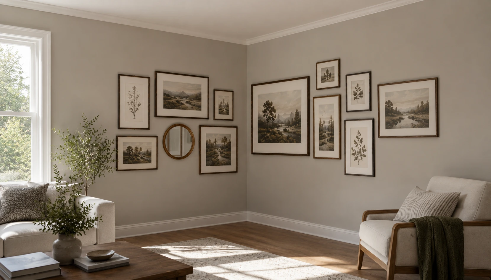
Not every corner is the same shape, and a shallow corner, where the two walls are short before hitting a window or doorway, needs a different approach than a deep one with real wall space on both sides.
In a shallow corner, keep the arrangement smaller and let it read as one continuous piece rather than trying to wrap it fully. Overfilling a shallow corner is what makes it feel cramped rather than styled. A deep corner, by contrast, can genuinely support a fuller wraparound arrangement with more pieces on each side.
Measure both walls of your corner before planning frame count. As a rough guide, a wall shorter than about three feet usually looks better with four to six pieces total across the whole corner, while a wall in the four to six foot range can comfortably support eight to twelve.
When in doubt, start smaller than you think and add pieces over time. It’s much easier to add one more frame to a gallery wall than to remove one without leaving a visible gap in the arrangement.
Leave Room to Grow the Collection
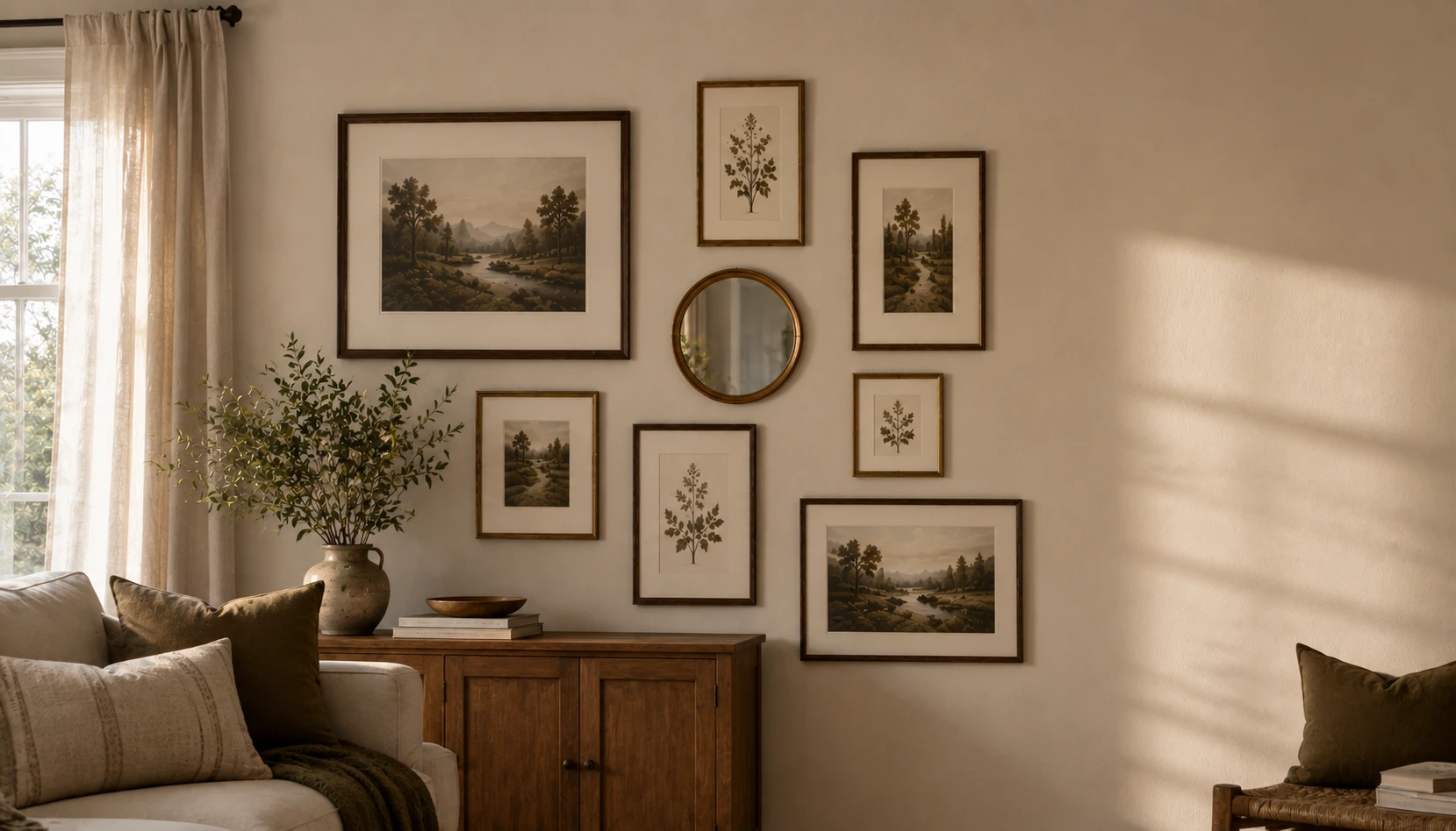
Leave one small, deliberate gap somewhere in the arrangement, most naturally toward the outer edge of one wall rather than right at the corner seam. This isn’t an oversight, it’s planning ahead for the next piece you’ll inevitably want to add six months from now.
A gallery wall that fills every available inch on day one has nowhere to go, which means the next new piece either gets crammed in awkwardly or the whole arrangement needs reworking. A planned gap solves this before it becomes a problem.
This matters more in a corner specifically than on a flat wall, since a corner arrangement is harder to reconfigure later precisely because of the angle. Building in flexibility from the start avoids having to redo the floor-layout step from Idea 12 all over again.
Think of the current arrangement as version one rather than a finished, permanent state. The best corner galleries genuinely do keep evolving over a year or two.
Common Corner Gallery Mistakes
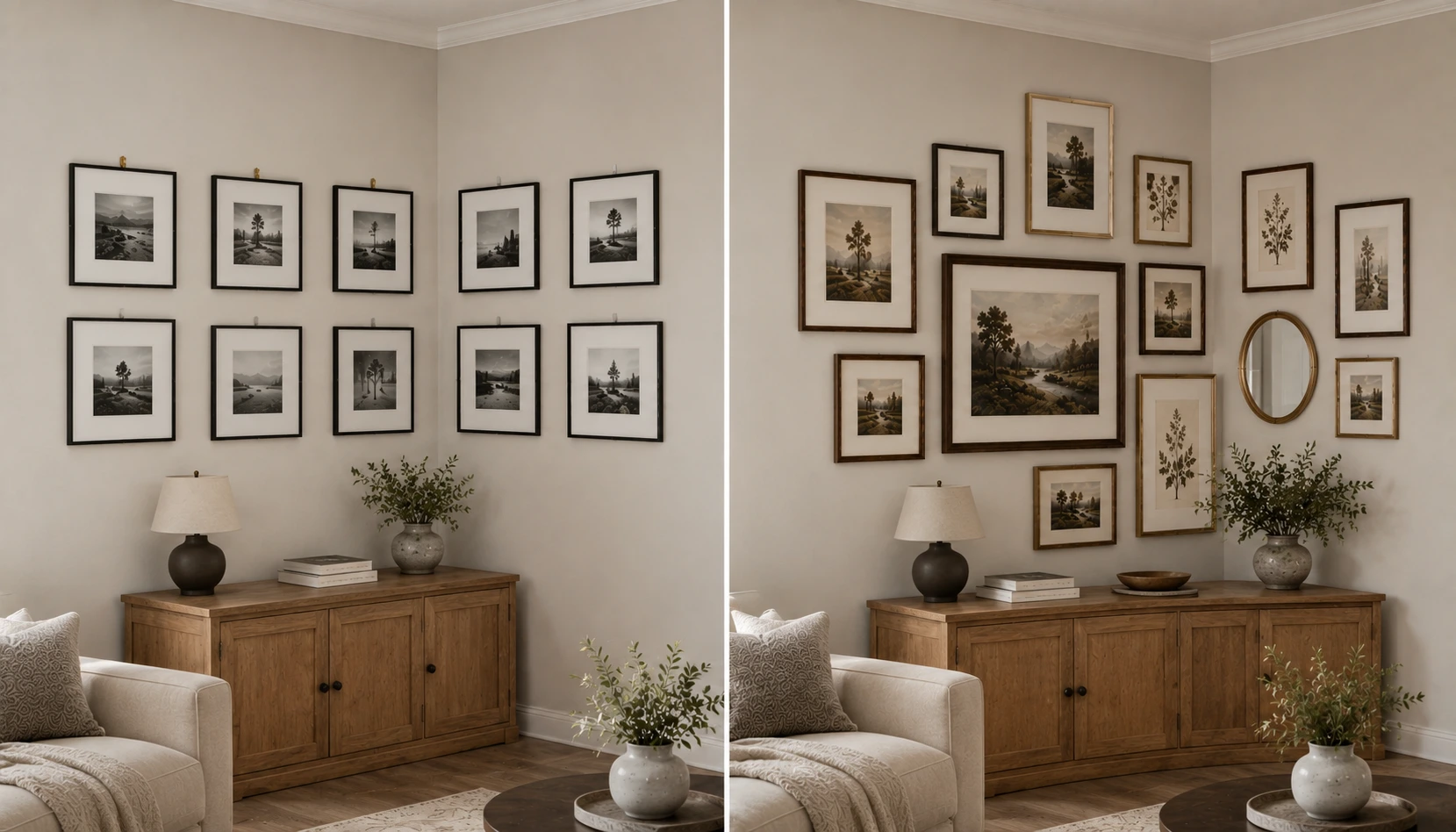
A handful of mistakes show up again and again with corner galleries specifically, separate from general gallery wall advice.
Mistake 1: Treating the corner like two separate flat walls. Building each side independently without considering how they meet is what creates the disjointed look people are trying to avoid in the first place.
Mistake 2: Skipping the floor layout test. Covered in Idea 12, and still the most common reason a corner gallery needs redoing.
Mistake 3: Uniform frames with no size or shape variety. What looks intentional on a flat wall often looks sparse and thin wrapped around an angle.
Mistake 4: Mismatched frame finishes. The single easiest thing to get right and the one that most separates a considered arrangement from a leftover-frames pile.
Mistake 5: Ignoring the corner’s actual light levels. A beautifully arranged gallery that disappears into shadow every evening isn’t finished yet.
Mistake 6: Filling every inch on day one. Leaves no room to grow and makes future additions awkward.
A corner doesn’t have to stay the empty spot nobody knows what to do with. Start with one large anchor piece, work outward with a clear layout line, and test everything on the floor before committing to nail holes. The seam that makes a corner feel awkward in the first place is exactly what makes it interesting once it’s actually styled.
For more wall styling ideas that extend naturally from this same approach, see our guide to Decorative Plate Wall Ideas, or for a full room built around one considered layout, see Room Decoration Ideas for Small Spaces.