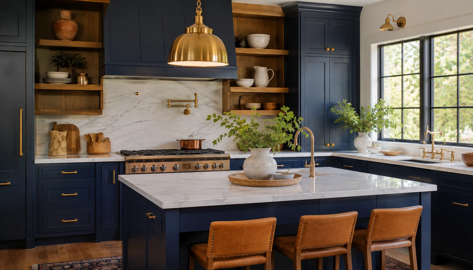
Navy blue kitchen cabinets have a reputation problem. Done well, navy reads as custom, expensive, and considered, the kind of kitchen that looks like it belongs in a design magazine. Done without thinking about the room’s actual light, it can just as easily read as dark, heavy, and closed in.
The difference almost always comes down to one factor nobody talks about enough: which direction your kitchen actually faces. A navy kitchen bathed in warm afternoon sun behaves completely differently from the same navy in a north-facing room that only ever gets cool, indirect light. Most navy kitchen guides give you one set of pairings and assume it works everywhere. It does not.
This guide covers both situations directly, along with the shade selection, hardware, and lighting choices that make navy feel intentional rather than accidental, whichever way your kitchen faces.
Why Navy Works in a Kitchen
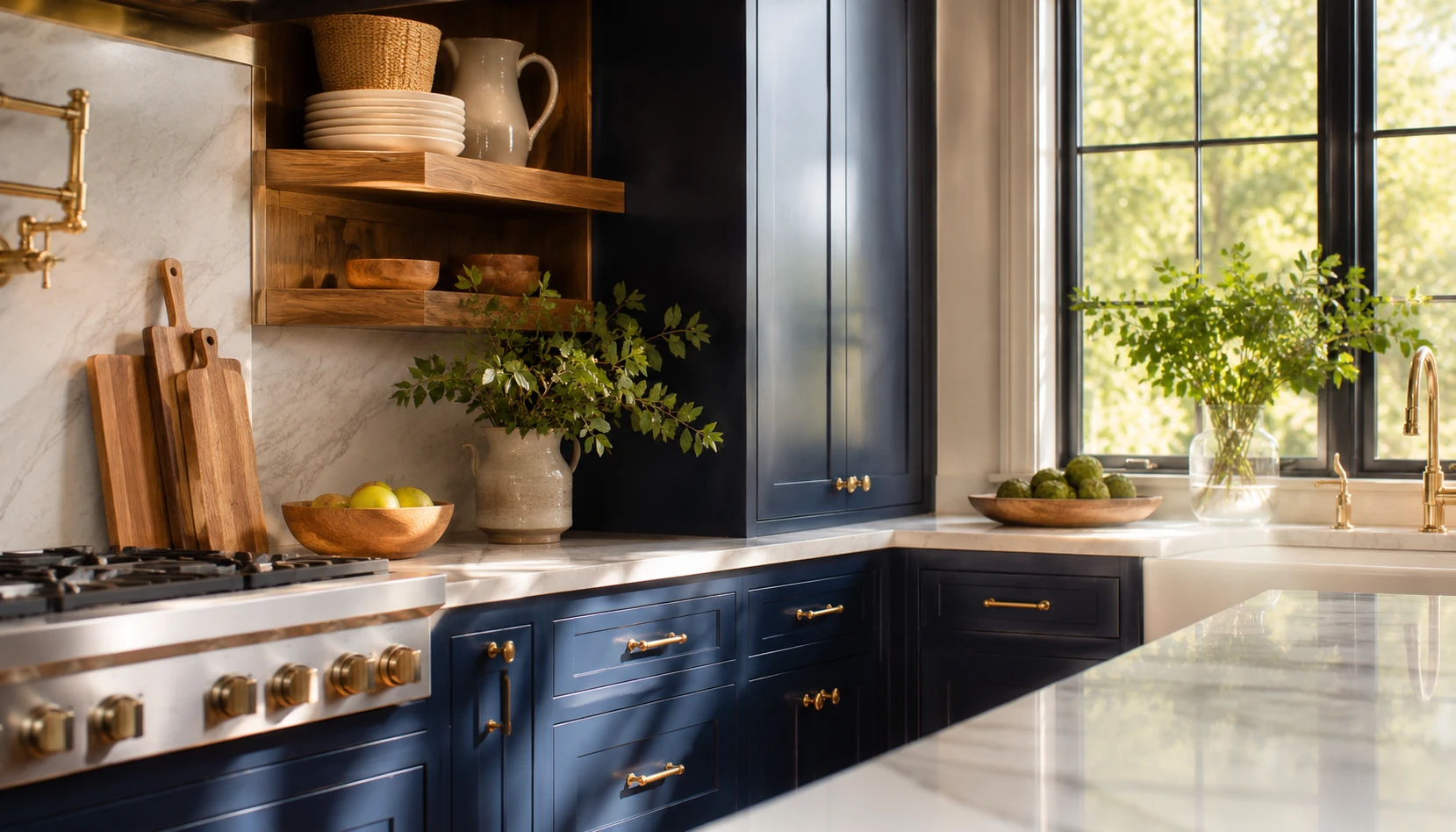
Navy has become one of the most requested kitchen colors for a reason that goes beyond trend cycles.
It reads as a neutral from a distance. Navy is dark enough to feel dramatic but close enough to black that it pairs with almost any metal finish, countertop, or wood tone without a lot of careful color theory.
It photographs better than true black. Black cabinetry can look flat and one-dimensional in photos, while navy holds subtle depth and undertone that shows up beautifully in both natural light and flash photography, part of why it performs so well on Pinterest specifically.
It signals a considered design choice. A white kitchen is the default. A navy kitchen tells a visitor that someone made a deliberate decision, which is exactly the feeling most homeowners are chasing when they describe wanting their kitchen to look expensive.
It hides daily wear better than white. Water spots, fingerprints, and general kitchen grime show far less on a deep navy finish than on white or pale cabinetry, a practical bonus alongside the visual one.
It pairs with more trends than any other bold color. Navy works with brass-heavy traditional kitchens, black-hardware modern kitchens, and warm wood Scandinavian kitchens equally well, which is part of why it has stayed popular longer than most bold kitchen colors typically do.
The catch is that all of this only holds true when the surrounding light and material choices are right for your specific room, which is exactly what the next two sections cover.
Navy in North-Facing Kitchens
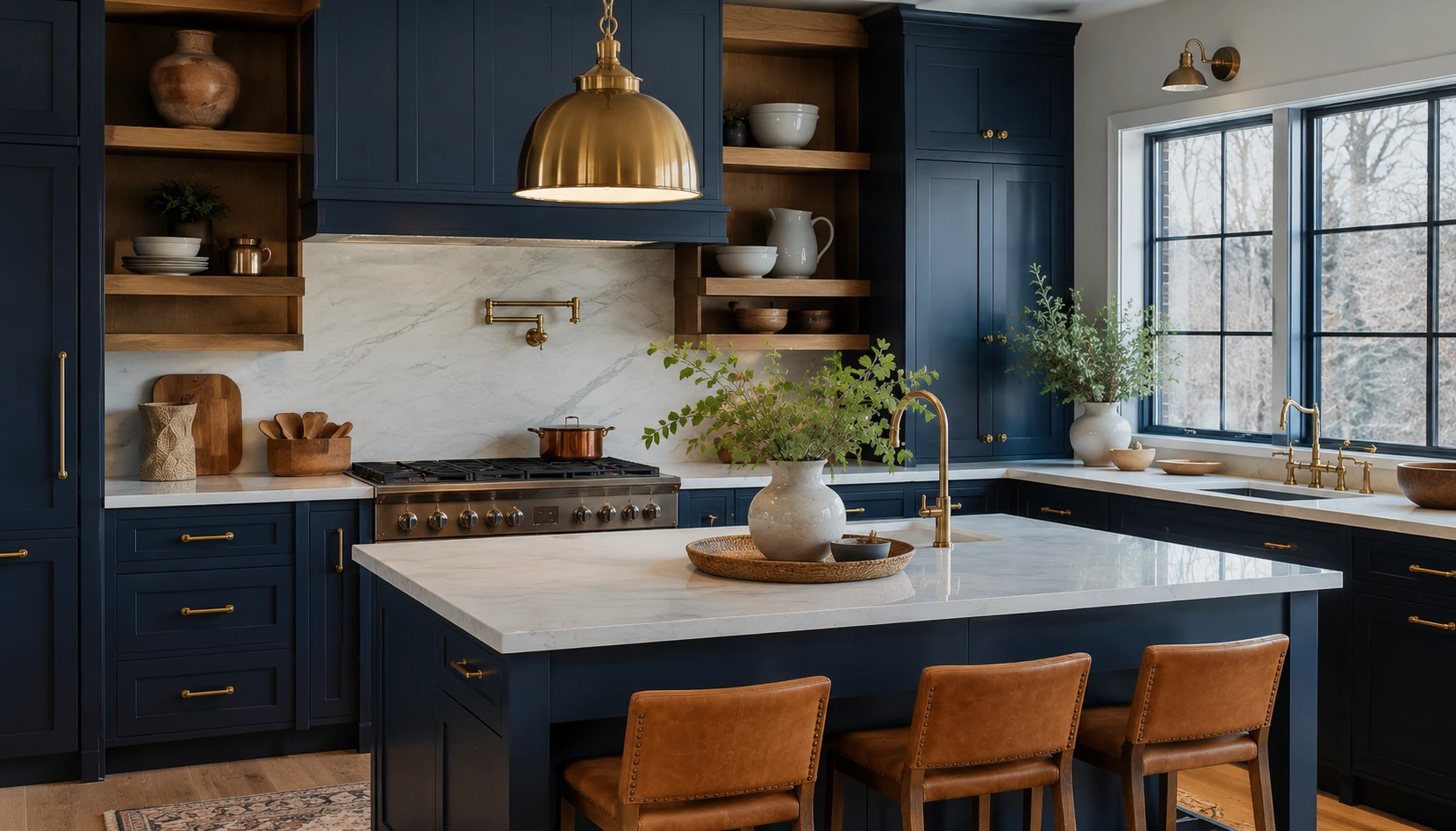
A north-facing kitchen only ever receives indirect, cool-toned daylight, which changes how navy behaves more than almost any other single factor.
Choose a navy with a hint of warmth in its undertone. A true cool-toned navy on top of already-cool daylight can read as flat and almost gray by midday. Look for a navy with a slightly warmer, more indigo undertone to counteract the room’s natural light.
Lean hard into brass and warm gold hardware. In a north-facing room, warm metal tones do more work than in a south-facing one, since they are one of the few warm elements the room gets without direct sun.
Add warm-toned wood somewhere in the room. A butcher block island top, warm oak open shelving, or even a wood bar stool set introduces the warmth that the daylight itself is not providing.
Increase your artificial lighting more than you think you need to. North-facing kitchens rely far more heavily on fixture lighting throughout the day, so layer in under-cabinet lighting and warm-toned overhead fixtures rather than relying on a single ceiling light.
Avoid pairing with cool white or gray countertops. A stark white or blue-gray quartz countertop compounds the coolness of both the light and the cabinet color. A warmer white, a cream, or a countertop with gold veining balances the room instead.
Get this pairing right and a north-facing navy kitchen can feel cozy and intentional rather than the dim, closed-in feeling that navy sometimes gets blamed for unfairly.
Navy in South-Facing and Bright Kitchens
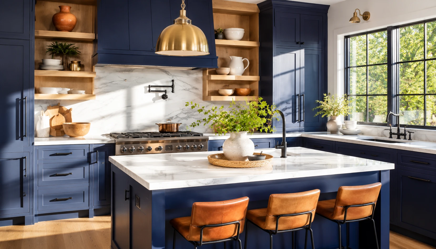
A south-facing kitchen with abundant direct sunlight has considerably more flexibility with navy, since the room is already supplying its own warmth for most of the day.
A true, cooler-toned navy reads beautifully here. Without the risk of the room feeling flat, a crisper navy with less warm undertone can look sharp and sophisticated rather than heavy.
White or pale marble countertops create striking contrast. The abundant natural light keeps a stark white countertop from feeling cold, so this is the ideal setting for the classic navy-and-white marble pairing.
Mixed metals become an option, not just brass. A south-facing kitchen can support chrome, nickel, or matte black hardware just as well as brass, since the room’s own light does more of the warming work that brass would otherwise provide in a darker room.
Consider navy on a full wall of cabinetry rather than just an island. The brightness of the room can carry a bolder, larger navy commitment without the kitchen feeling closed in the way it might in a dimmer space.
Watch for glare on glossy navy finishes. Direct sun hitting a high-gloss navy cabinet front can create harsh reflections at certain times of day. A satin or matte finish handles bright direct light more gracefully than high-gloss lacquer.
If your kitchen gets strong afternoon sun, this is the version of navy where you can take the most creative risks with confidence.
Choosing the Right Shade of Navy
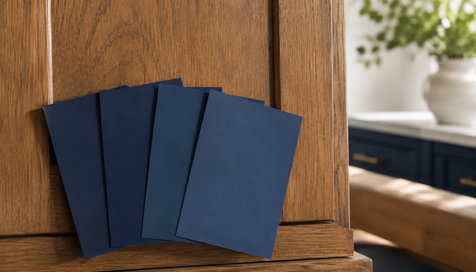
Not all navy is the same navy, and the difference between a warm and cool undertone can be the difference between a kitchen that feels right and one that feels slightly off without you being able to say why.
Test samples on the actual cabinets, not just a wall swatch. Cabinet doors have more surface texture and catch light differently than a flat painted wall, so a color that looks perfect on a paint chip can shift once it is on real cabinetry.
View samples at multiple times of day. Navy shifts dramatically between morning, midday, and evening light. A shade that looks perfect at 10am can look completely different by 6pm, especially in a room with strong directional light.
Go slightly darker than you think for cabinets, slightly lighter for an island only. A very dark, near-black navy works well across full cabinetry, while a slightly lighter navy on an island alone keeps it from feeling like a heavy anchor in the middle of the room.
Avoid anything with a strong purple undertone. Some navies lean subtly toward eggplant, which can clash with warm wood tones and brass hardware in a way that a true navy or indigo does not.
Pair your undertone decision with your light direction from the two sections above. A warmer navy undertone for north-facing rooms and a cooler, truer navy for south-facing rooms is the single most reliable rule in this entire guide.
Getting the undertone right before committing to a full cabinet repaint saves the single most common regret in navy kitchen renovations.
Pairing Navy with Wood Tones
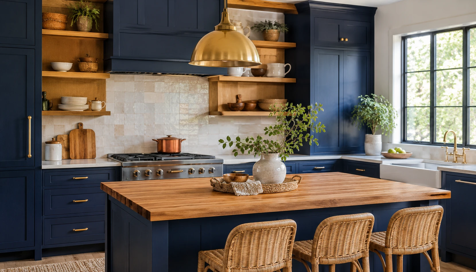
Navy on its own can feel heavy across an entire kitchen, which is exactly why wood tone pairing matters as much as the paint color itself.
Warm oak and walnut open shelving break up solid cabinetry runs. A run of open wood shelving among the upper cabinets adds texture and keeps the eye from reading the kitchen as one uninterrupted navy block.
A butcher block or wood island top softens a navy island. Pairing a navy island base with a warm wood countertop, rather than matching stone throughout, adds contrast and warmth exactly where the room’s largest single navy surface usually sits.
Wood flooring anchors the whole room. Even without any wood cabinetry, a warm wood or wood-look floor beneath navy cabinets keeps the room from feeling top-heavy with color.
Rattan and cane bar stools add texture without competing for color attention. These natural materials complement navy without introducing a third competing color into the room.
Keep wood tones warm rather than gray-washed. A cool, gray-toned wood pairs less successfully with navy than a warm honey or walnut tone, which does more to counteract navy’s inherent coolness.
This pairing principle applies regardless of which direction your kitchen faces, though it matters even more in the north-facing scenario covered earlier.
Hardware and Metal Finishes
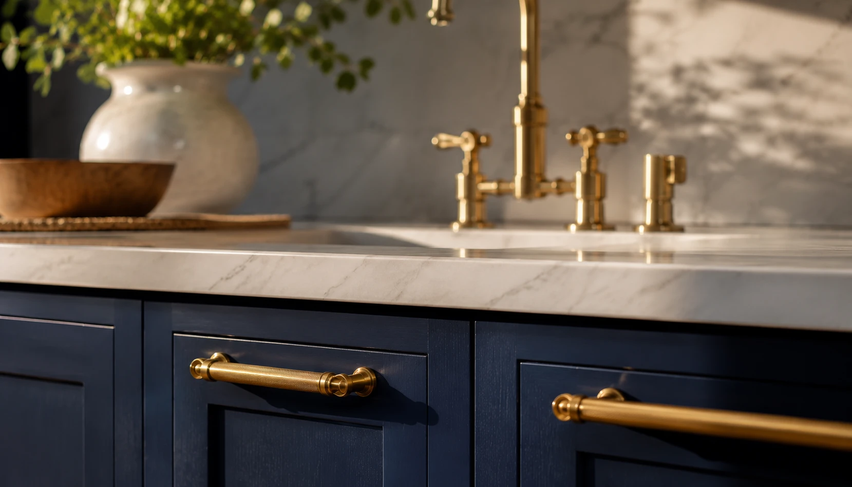
Cabinet hardware is a small physical object, but it changes how expensive or dated a navy kitchen reads more than its size would suggest.
Brass and warm gold remain the classic pairing. This combination has stayed popular because the warmth of brass directly counters navy’s coolness, which is especially valuable in the north-facing scenario covered earlier in this guide.
Matte black creates a more dramatic, modern look. For a bolder, more contemporary feel, matte black hardware against navy leans into the darkness rather than warming it up, working especially well in bright, south-facing kitchens.
Avoid polished chrome unless your kitchen is very bright. Polished chrome can look cold against navy in anything but a well-lit, south-facing room, where the abundant light keeps the combination from feeling sterile.
Keep faucet and cabinet hardware in the same metal family. Mixing brass hardware with a chrome faucet, or vice versa, is one of the most common inconsistencies that makes an otherwise well-designed navy kitchen look unplanned.
Consider aged or unlacquered brass for a less shiny option. For those wanting warmth without a highly polished look, an aged or unlacquered brass finish develops a soft patina over time that pairs beautifully with a matte navy cabinet finish.
Hardware is also one of the cheapest updates on this entire list relative to its visual impact, often achievable without touching the cabinets at all.
Countertop and Backsplash Pairings
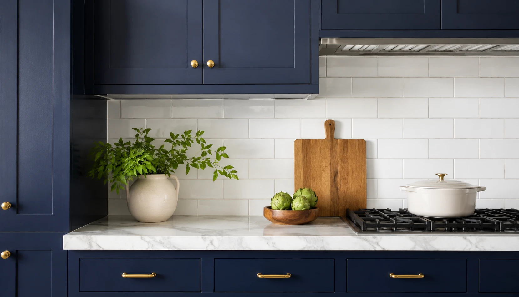
The countertop and backsplash carry roughly a third of a kitchen’s visual weight, which makes this pairing decision nearly as important as the cabinet color itself.
White or cream marble is the safest, most reliable pairing. This combination works in nearly every light condition and has stayed a design staple for exactly that reason, though a warmer cream marble suits north-facing rooms slightly better than a stark white one.
Butcher block adds warmth in cooler-light kitchens. As mentioned earlier, this pairs especially well with a north-facing navy kitchen where extra warmth is doing real work rather than just adding style.
A classic white subway tile backsplash keeps the focus on the cabinetry. This is the lowest-risk backsplash choice and lets the navy cabinets remain the room’s clear focal point.
A patterned tile backsplash can add personality in brighter kitchens. In a south-facing room with plenty of light to support it, a bolder patterned backsplash can coexist with navy cabinetry without the room feeling overloaded.
Avoid dark or black countertops paired with navy cabinetry. This combination tips the whole kitchen into feeling uniformly dark, especially in a north-facing room, removing the visual break the countertop is supposed to provide.
The countertop is one of the more expensive decisions in this guide, so it is worth testing physical samples against real cabinet paint swatches before committing.
Lighting Strategy for a Navy Kitchen
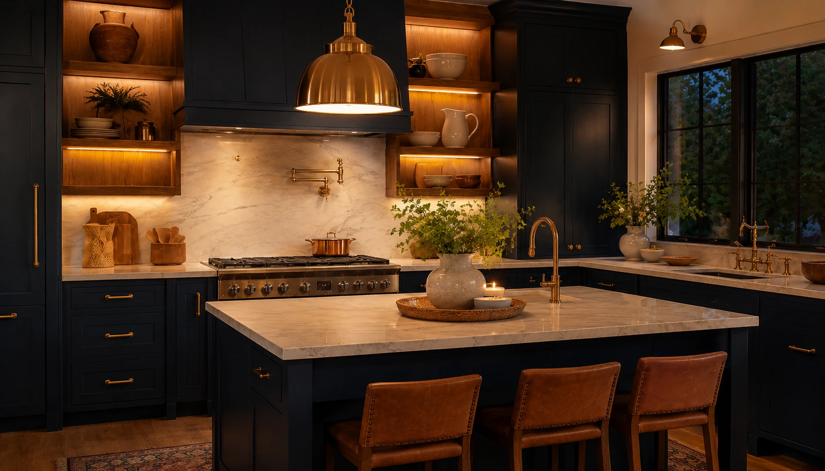
Dark cabinetry absorbs more light than pale cabinetry, which means a navy kitchen generally needs more deliberate lighting planning than a white one, regardless of which way the room faces.
Add under-cabinet lighting as a near-requirement, not an option. This single addition does more to keep a navy kitchen from feeling dim than almost any other lighting choice, especially over dark countertops.
Choose warm-toned bulbs throughout, in the 2700K to 3000K range. Cooler bulbs above 4000K compound navy’s inherent coolness, particularly in a north-facing room that is already lacking warm natural light.
Add pendant lighting over an island in a warm metal finish. Beyond function, pendants in brass or warm brushed gold reinforce the warmth strategy already established through hardware choices.
Consider a dimmer for main overhead fixtures. The ability to shift from bright task lighting during meal prep to a softer evening mode changes how the whole room feels without requiring any additional fixtures.
Do not rely on natural light alone, even in a bright south-facing kitchen. Evening hours and overcast days still require the same layered artificial lighting strategy, since navy remains a light-absorbing color regardless of the room’s orientation.
Lighting is one of the most overlooked factors in navy kitchen planning, and getting it right resolves most of the “too dark” complaints that navy kitchens sometimes get.
Island Only vs Full Cabinetry
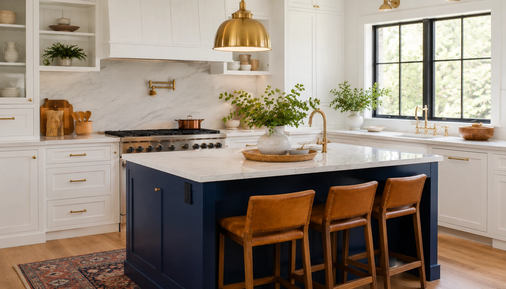
Deciding how much of the kitchen to commit to navy is often the biggest practical decision in this entire process, and it does not have to be all or nothing.
A navy island against white or cream perimeter cabinets is the lowest-risk entry point. This approach delivers most of navy’s visual drama while keeping the rest of the room bright, and it is far less expensive than repainting or replacing every cabinet in the kitchen.
Full navy cabinetry creates the most dramatic, cohesive look. For those ready to fully commit, navy across every cabinet reads as the most intentional, considered choice, particularly in a bright south-facing room that can support the darker overall palette.
Upper cabinets in a lighter color with navy lowers is a popular middle ground. This keeps the upper portion of the room feeling open while still delivering navy’s dramatic effect at counter height where it is most visible.
Consider your actual kitchen size before committing to full cabinetry. A very small, enclosed kitchen with limited natural light is generally better suited to the island-only or lower-cabinets-only approach covered in the small kitchen section further down this guide.
An island-only approach is also the easiest to reverse. If navy ends up not suiting the space as expected, repainting or refacing a single island is a far smaller project than an entire kitchen’s worth of cabinetry.
Whichever amount of navy you choose, pair it with the light-direction guidance from earlier in this guide rather than treating that advice as relevant only to full cabinetry commitments.
Wall Color and Ceiling Choices
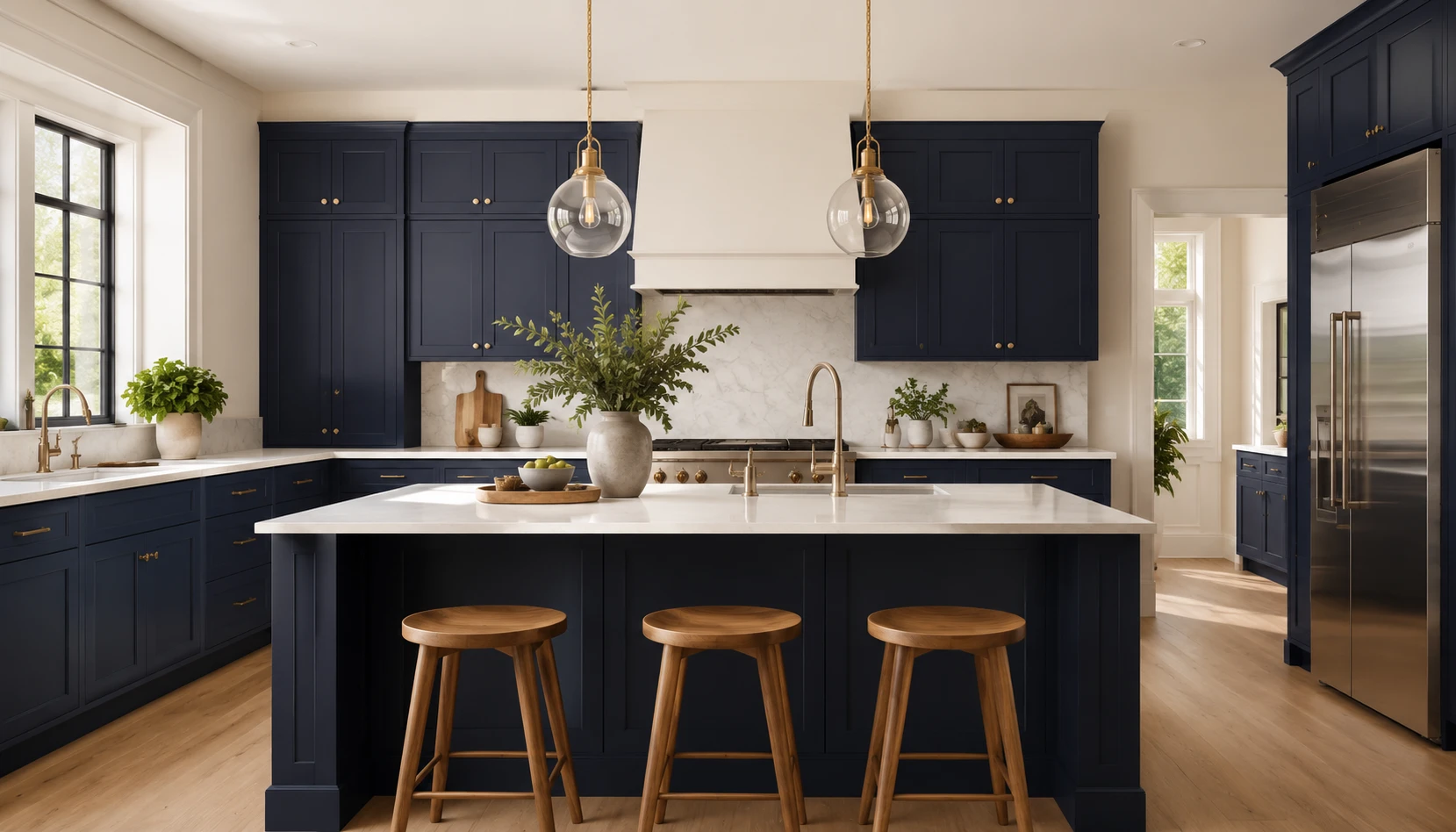
The walls and ceiling surrounding navy cabinetry get far less attention than the cabinets themselves, but they carry real weight in how the finished room feels.
A soft white or warm cream wall color creates the most reliable contrast. This keeps the room feeling open regardless of cabinet coverage, and it is the safest default choice for most navy kitchens.
Avoid painting walls in another saturated color alongside navy cabinets. Two bold colors competing in one room, especially a smaller one like a kitchen, tends to feel overwhelming rather than intentional.
Keep the ceiling a soft white rather than a stock builder white. A slightly warmer white ceiling, rather than a stark blue-white, keeps the room’s uppermost surface from feeling cold, particularly important in the north-facing scenario.
Consider a light, natural wood tone if you want texture instead of paint. A wood-clad accent wall or wood ceiling beams add warmth and texture without introducing an additional competing paint color.
Match trim color to the wall rather than a stark white. A trim color closer to the wall’s own tone, rather than a high-contrast white, creates a calmer overall look that lets the navy cabinetry remain the room’s clear focal point.
These choices are inexpensive relative to the cabinetry itself and are worth finalizing before committing to a full navy repaint.
Small Kitchen Considerations
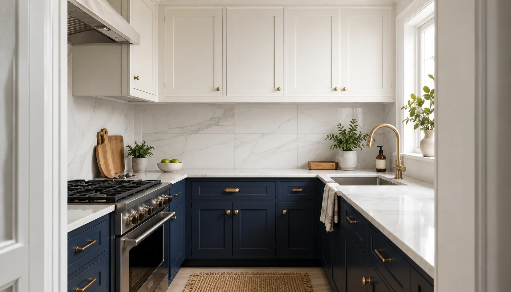
A small kitchen changes the navy calculation somewhat, though it does not rule the color out the way many guides suggest.
Use navy on lower cabinets only, with a lighter upper cabinet color. This keeps visual weight low in the room while still delivering navy’s dramatic effect, an approach that works especially well in a small, enclosed kitchen.
Prioritize the lighting strategy from earlier even more heavily. A small kitchen with less natural light to begin with needs the layered lighting approach covered above more urgently than a larger, brighter room would.
Choose a large-format tile or a single continuous countertop material. As with a small bathroom, fewer visual breaks and grout lines help a small navy kitchen avoid feeling busier than its footprint already makes it feel.
Add a large mirror or reflective backsplash where possible. Just as in a small bathroom, reflective surfaces help bounce available light around a small navy kitchen more effectively than in a larger room with light to spare.
Keep hardware and finishes to one consistent metal throughout. A small room shows mismatched finishes more obviously than a larger one, so consistency matters even more here.
For more strategies built specifically around small footprints, see our guide to small kitchen ideas, which covers additional layout and storage principles that apply just as well to a small navy kitchen.
Common Navy Kitchen Mistakes
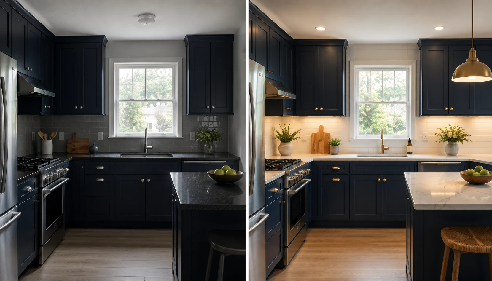
Even a well-intentioned navy kitchen project can go wrong in a few predictable ways. Here is what to watch for.
Mistake 1: Ignoring which direction the kitchen faces. This is the single biggest factor covered in this entire guide, and skipping it is the most common reason a navy kitchen ends up feeling colder than expected.
Mistake 2: Choosing a cool-undertone navy in a north-facing room. This combination compounds itself, leaving the kitchen feeling flat regardless of how good the cabinetry looks in the paint store.
Mistake 3: Skipping under-cabinet lighting. Dark cabinetry needs more layered light than pale cabinetry, and this is the step most commonly skipped during a budget-conscious renovation.
Mistake 4: Mixing hardware and faucet finishes. Brass cabinet pulls next to a chrome faucet is a small inconsistency that stands out more than most homeowners expect once the kitchen is finished.
Mistake 5: Pairing navy with a dark countertop. This removes the visual break the countertop is supposed to provide and tips the whole room toward feeling uniformly dark.
Mistake 6: Committing to full cabinetry without testing samples in the actual room. Navy shifts more dramatically between lighting conditions than most colors, making in-room testing more important here than for almost any other cabinet color choice.
Mistake 7: Forgetting warmth entirely in a north-facing room. Wood tones, brass hardware, and warm bulb temperature are not optional extras in a cool-light kitchen, they are the elements doing the real work of making navy feel inviting rather than cold.
Navy blue remains one of the most reliable ways to make a kitchen feel considered and expensive, as long as the shade, hardware, and lighting choices actually match the light your specific kitchen receives. Start by identifying whether your kitchen leans north-facing or south-facing, then build the rest of the decisions around that one fact first.
For two more color-led kitchen transformations using this same single-color, single-room approach, see our guides to Deep Plum Kitchen Ideas and Olive Green Kitchen Ideas.